
Send
Section title
Section subtitle
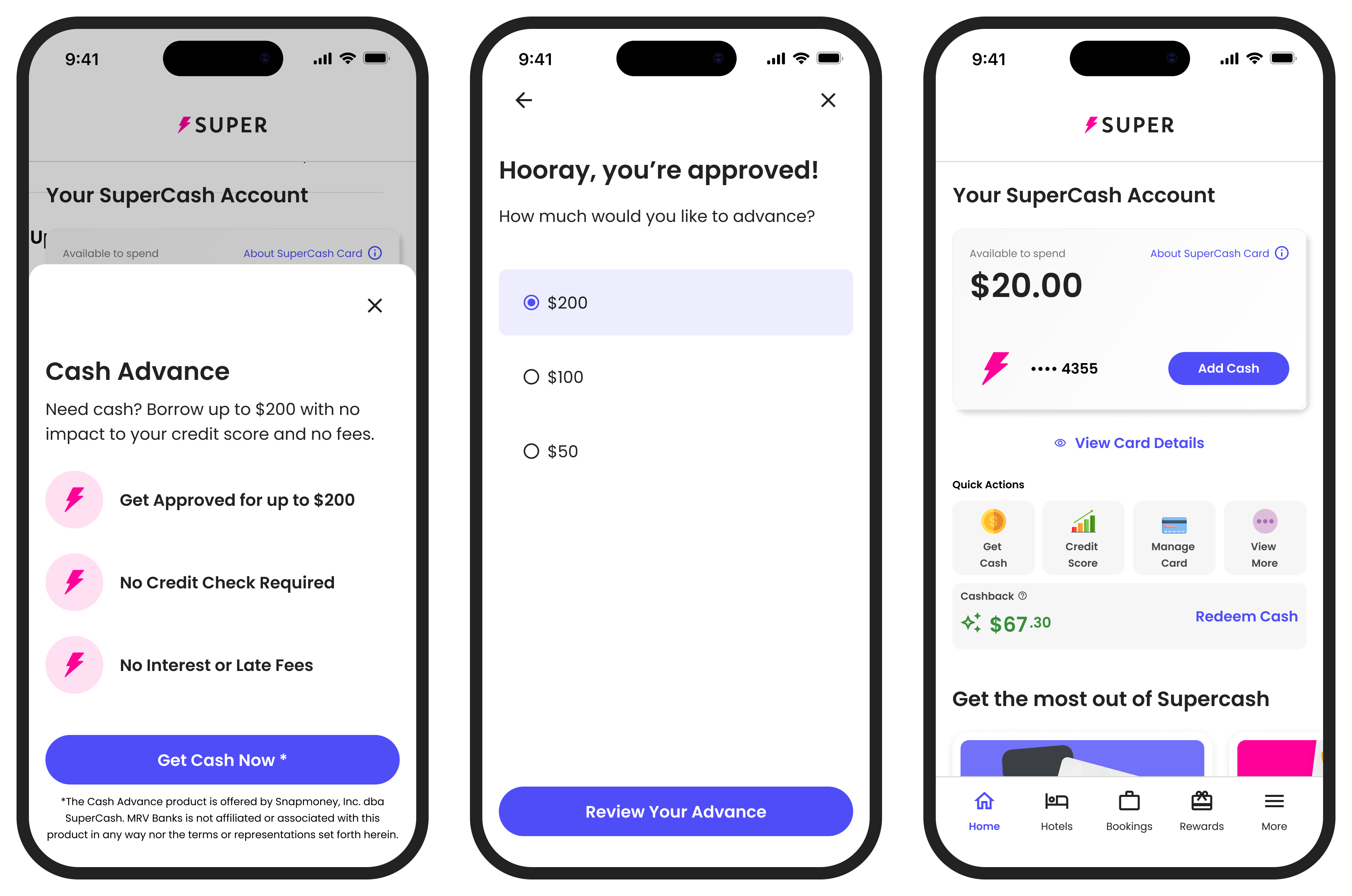
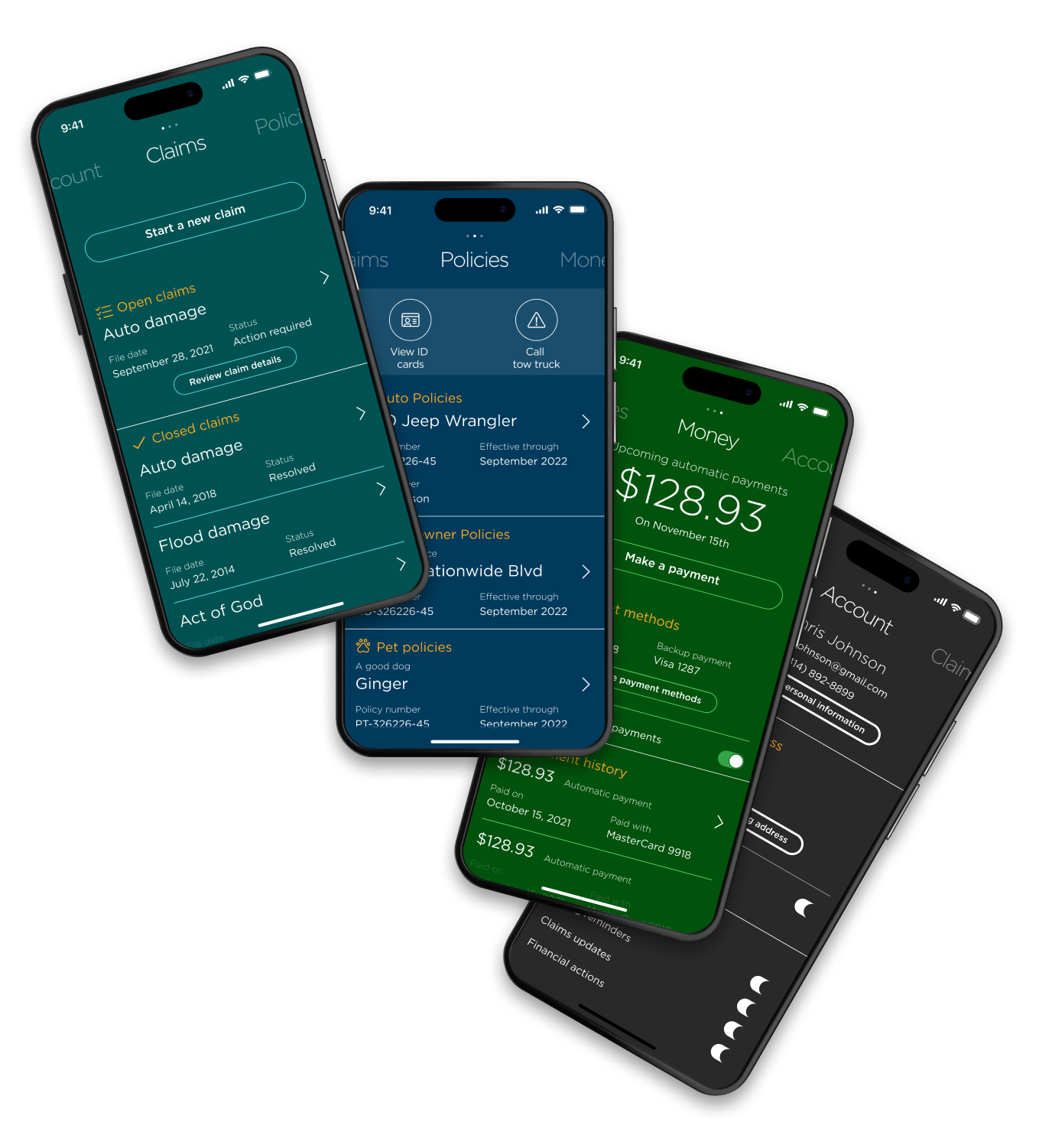
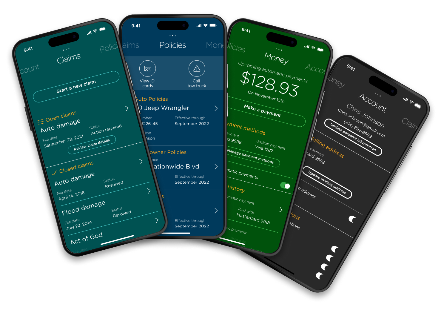
We talked with Customer Support to find the biggest pain points.
The business shifted focus to retaining customers.
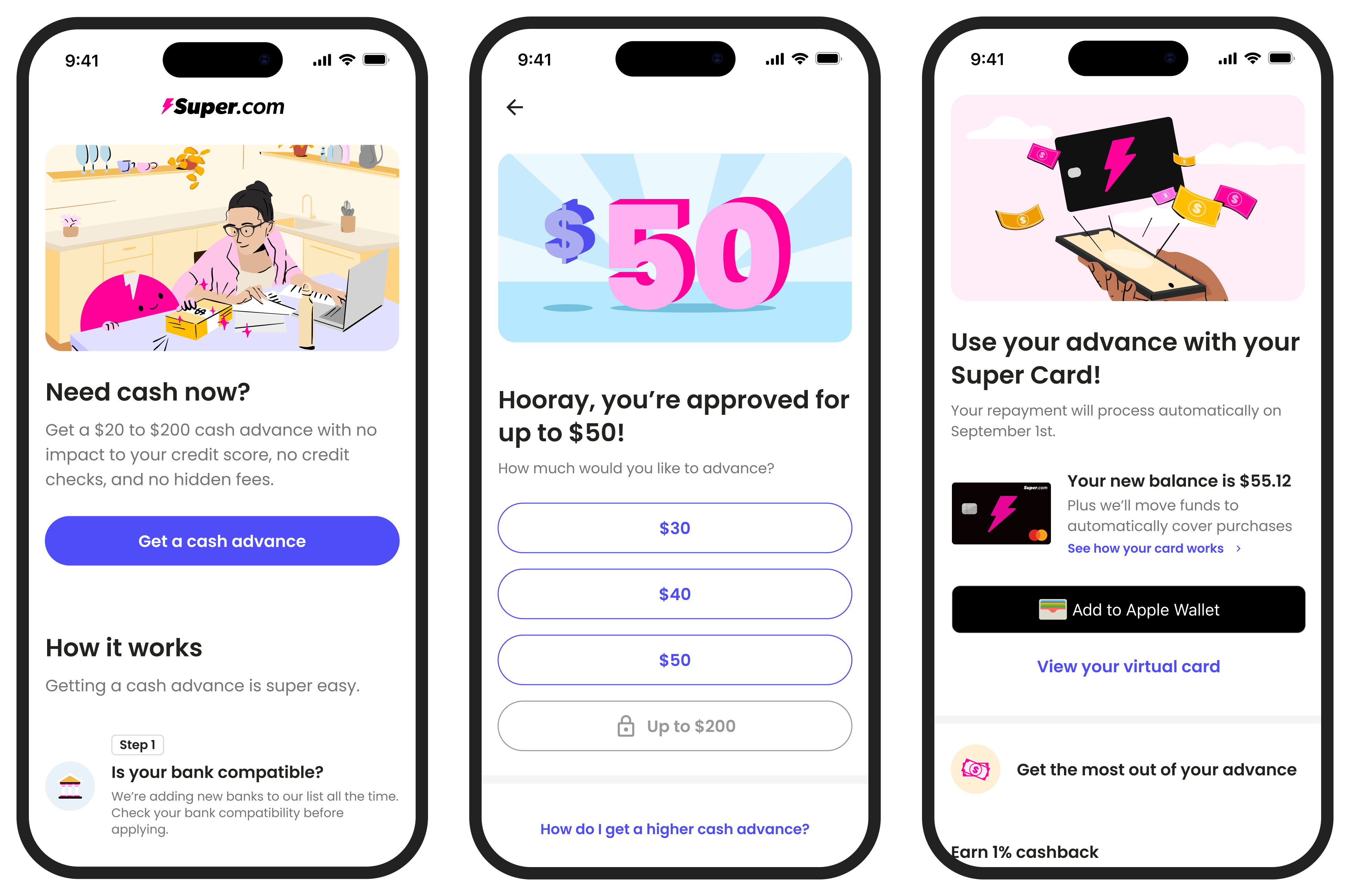
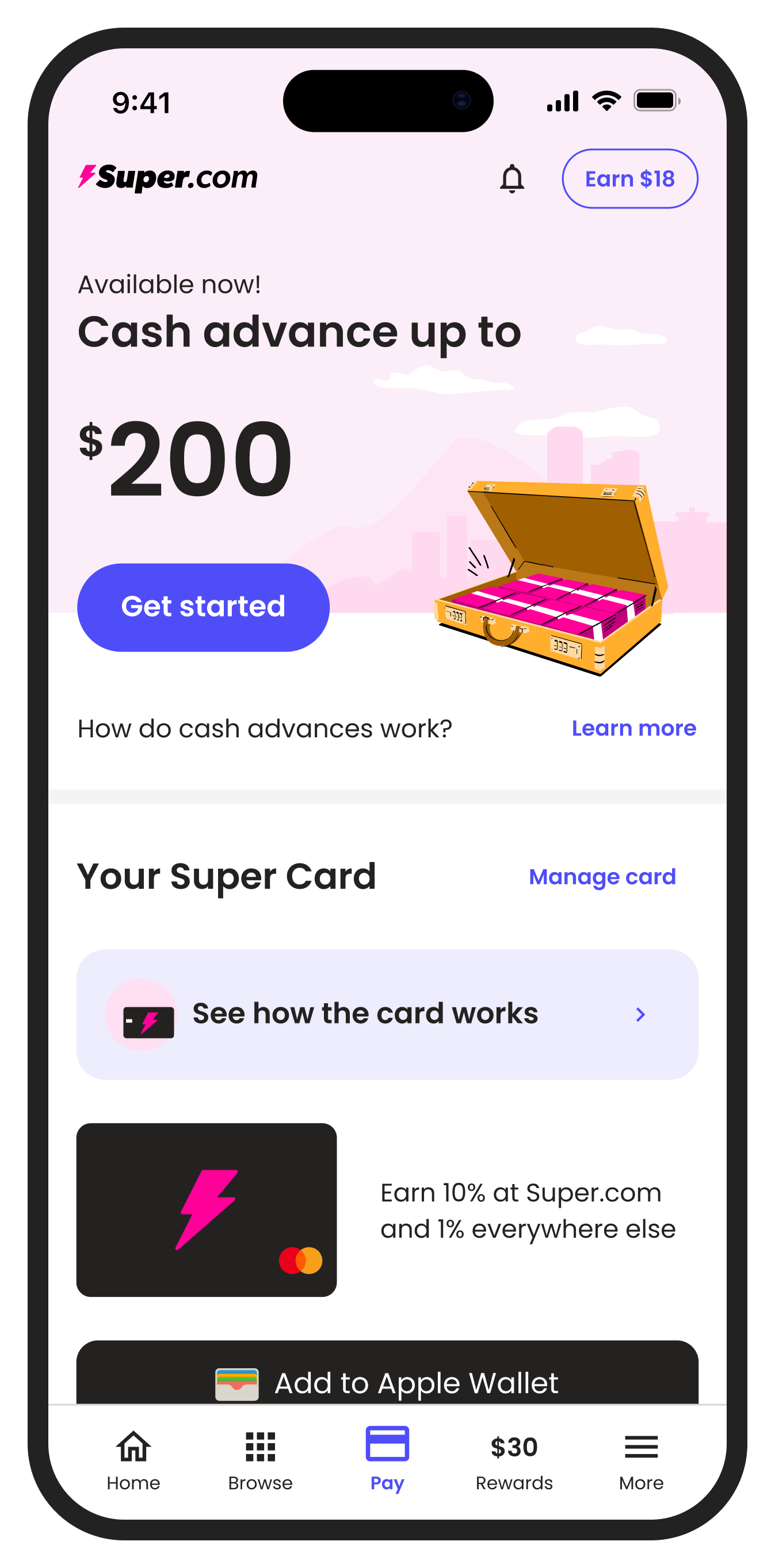
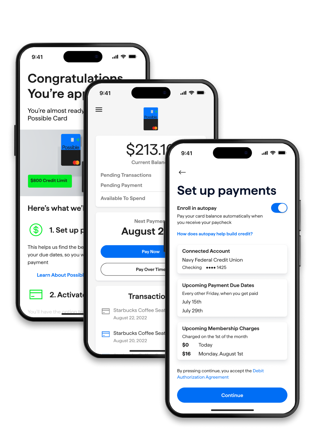
Our initial focus was getting the experiment out and launching a cash advance product. Once we had a user base, we could shift our focus to improving the product.
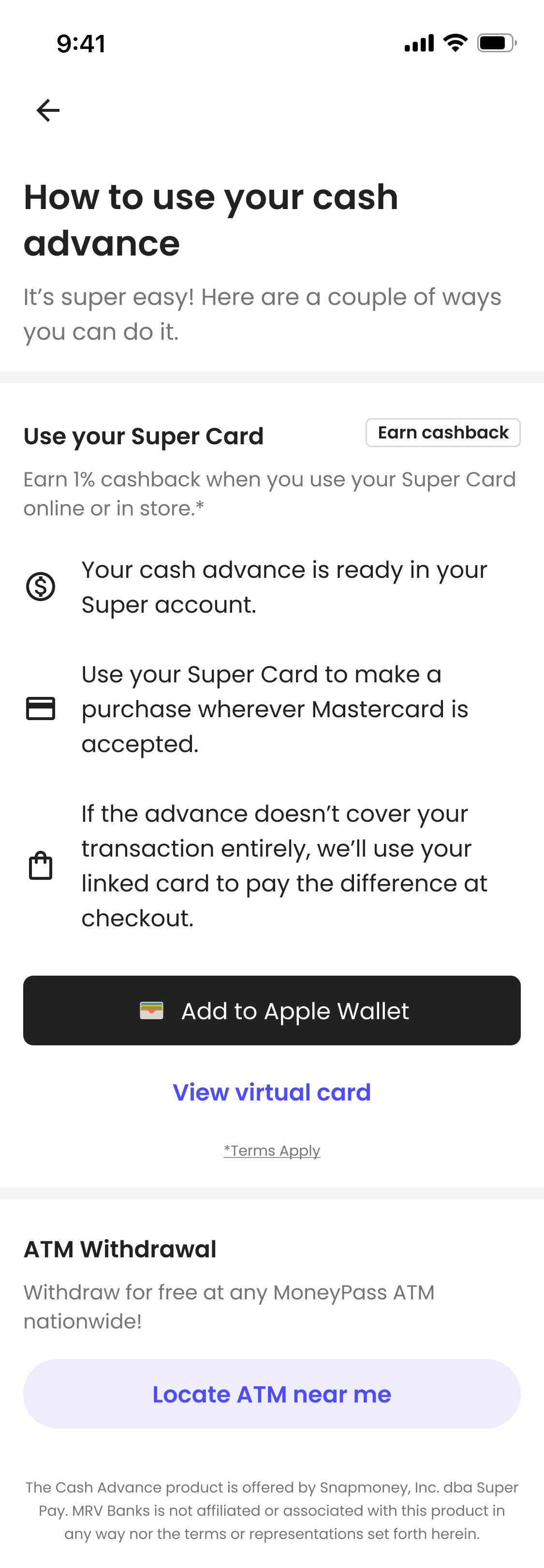
The product worked but it wasn't very inspiring or clear.
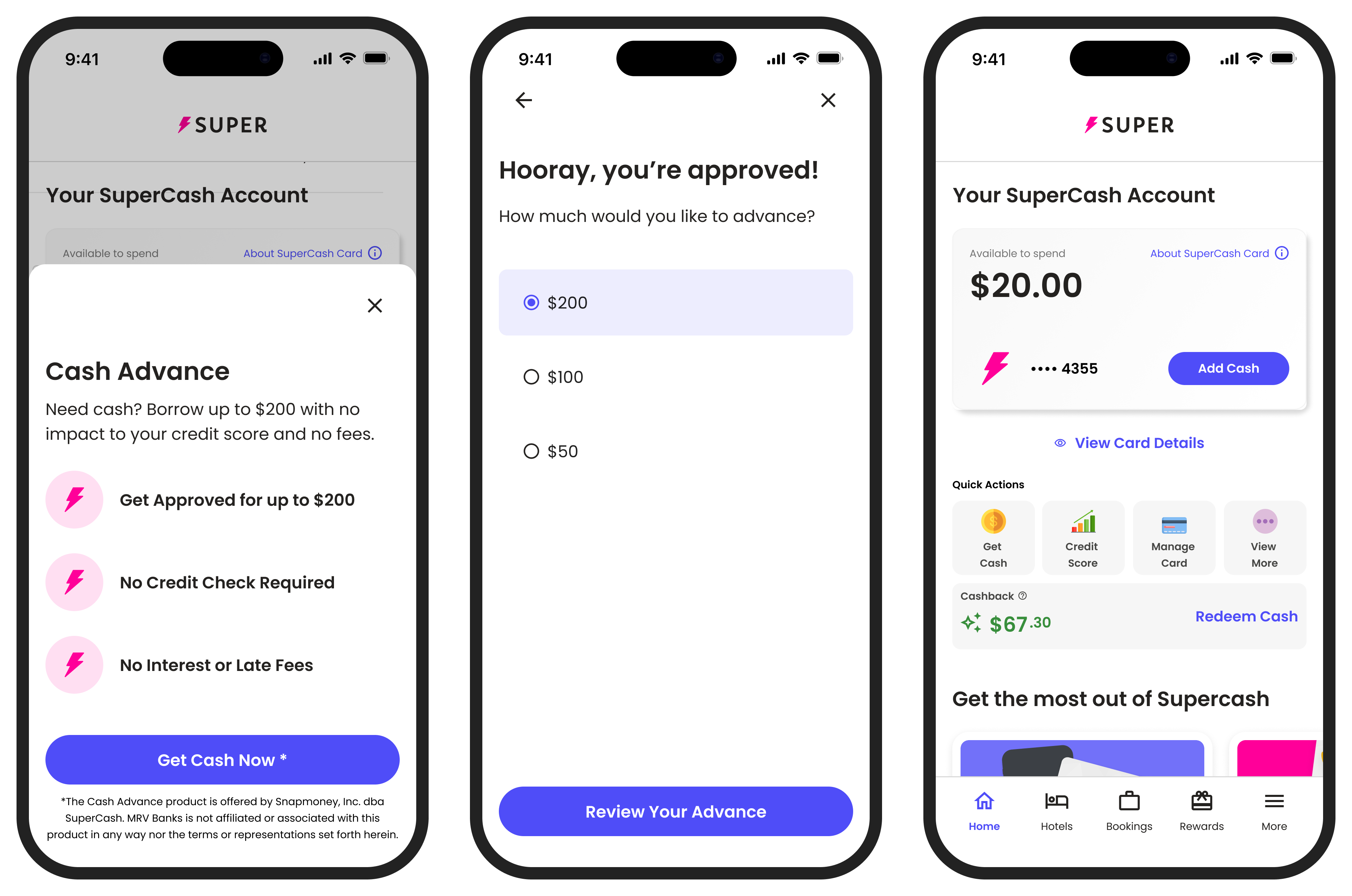
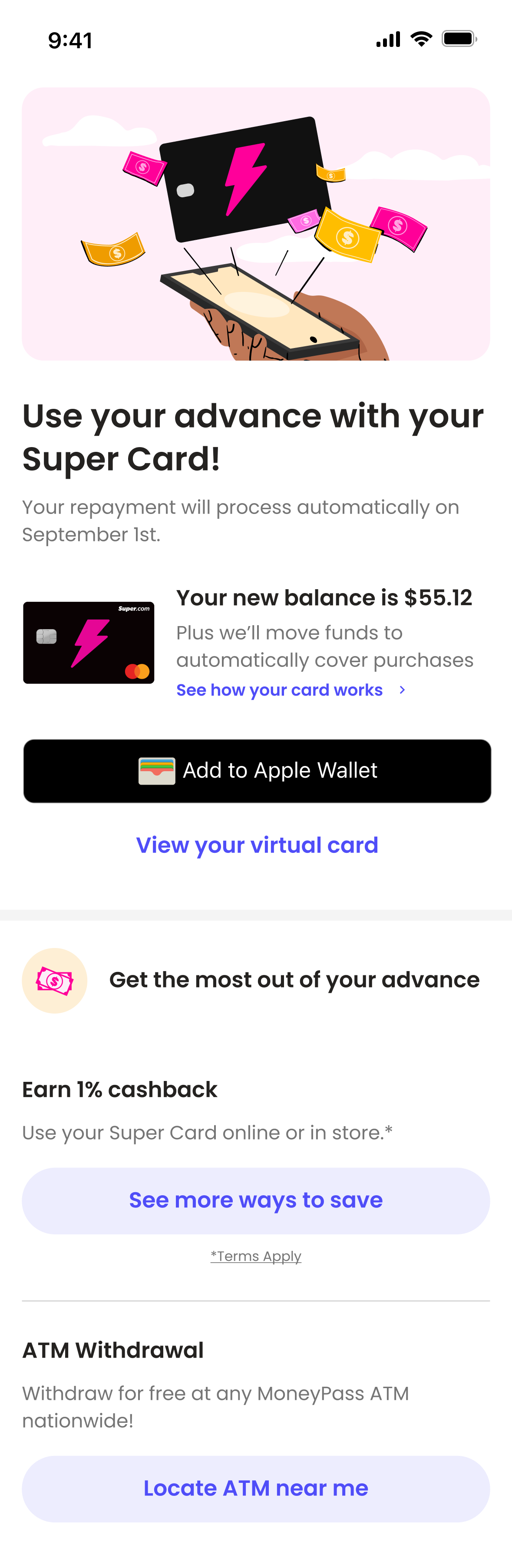
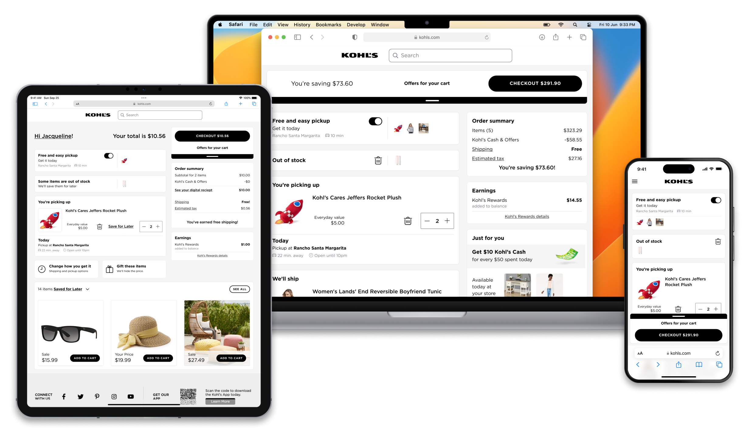
The business shifted focus to retaining customers.
Our initial focus was getting the experiment out and launching a cash advance product. Once we had a user base, we could shift our focus to improving the product.
The product worked but it wasn't very inspiring or clear.
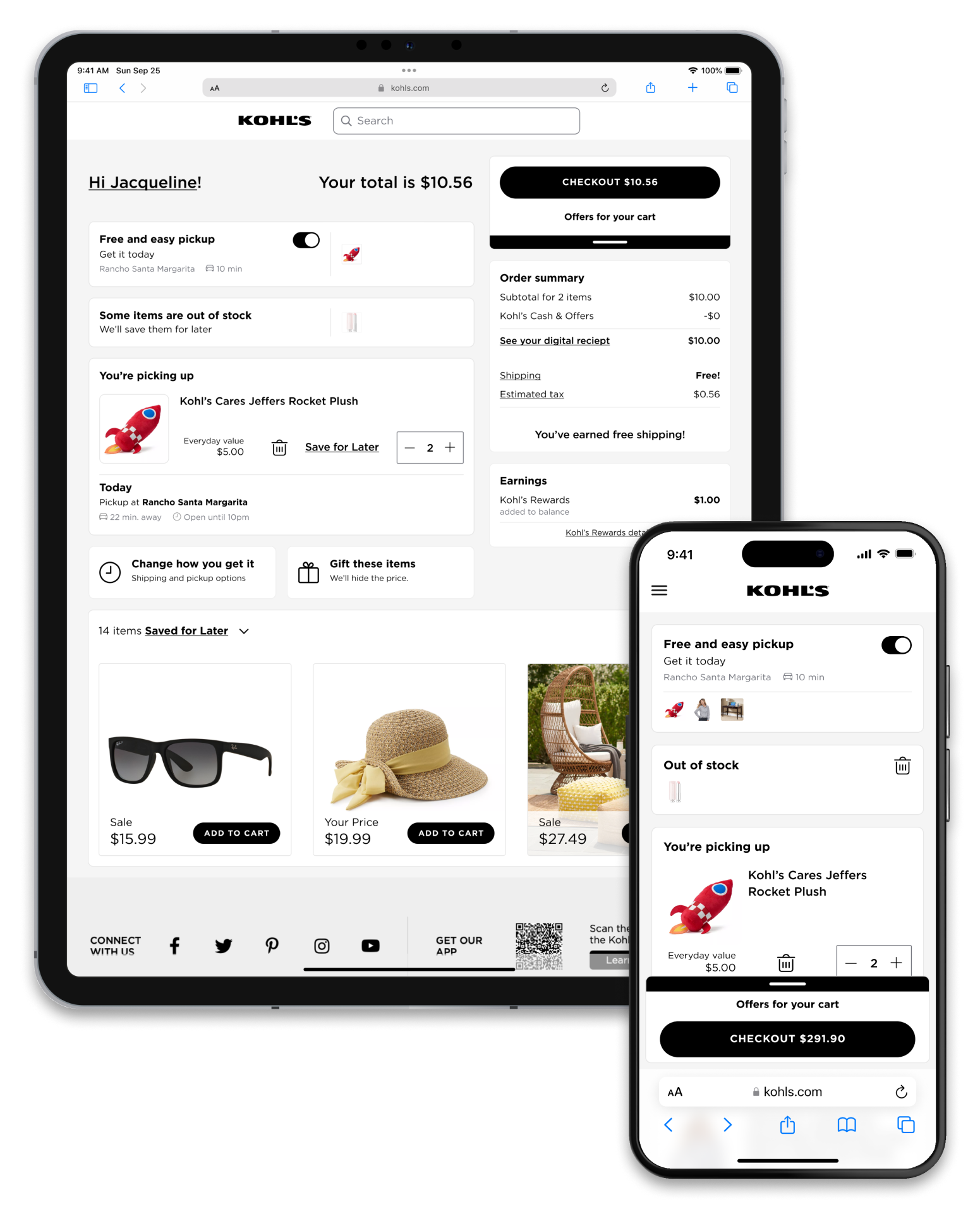
The business shifted focus to retaining customers.
Our initial focus was getting the experiment out and launching a cash advance product. Once we had a user base, we could shift our focus to improving the product.
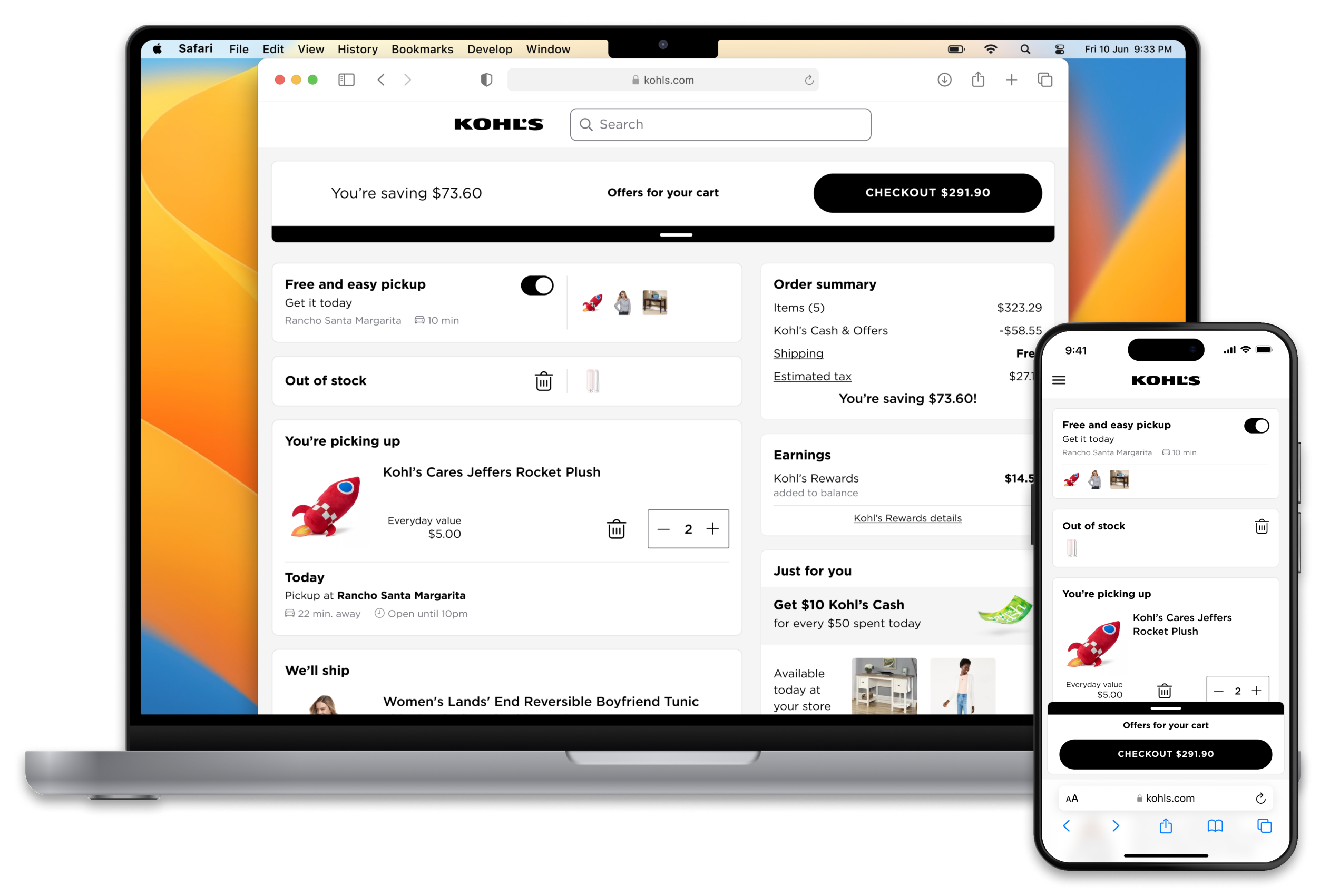
The product worked but it wasn't very inspiring or clear.