Possible Finance
Breaking the debt trap caused by payday loans
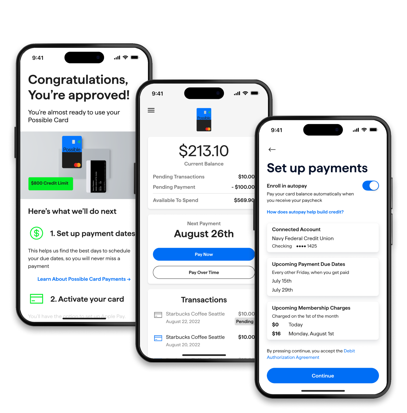
Project overview
In the U.S. the people who can't cover an emergency have the least access to credit. For many, the only option is a payday loan but that means high fees and huge interest charges. Most payday loans also don't report positive payments to the three credit bureaus.
I wasn’t the first designer on the team. We were organized in a classic pod structure, but I made a point to strengthen the relationship between design and back-end engineering.
• Sign ups
• Customer satisfaction
• Initial purchase rate
This was a true startup experience, I did a little of everything. I was part of a 3 person design team and the only designer for several months.
Ongoing for 12+ months but this case study focuses on about 2 months of work.
• Wireframes and final screen UI from Figma
• Usability Test assets
• Customer Journey Maps and Flow Diagrams
+45%
Customer satisfaction
-33%
Decrease in screens
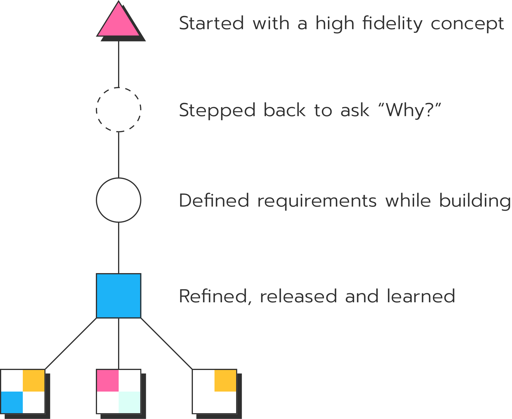
This is how we brought a new kind of credit card to market.
First, we wanted to release a good product. Not a perfect one. The idea was to get this in the hands of our customers and get feedback.
Second, we needed to secure funding. Payday loans are traditionally very profitable but doing them in a customer-centric way is not. Showing the value of the product and the potential market would be the foundation of the new funding round.
Finally, we needed to iterate. Quickly. The first pass was never going to be perfect. We needed to turn our viable product into something valuable.
Because 67% of Americans can't cover a $400 emergency.
35%
Have subprime credit cards
74%
Denied credit due to score
$120,000,000
Paid in interest and late fees per year
We had a successful loan product but it was limited.
Customers could borrow up to $500 to get to the next pay day and they could pay that back over the next 4 paychecks with no interest and no late fees.
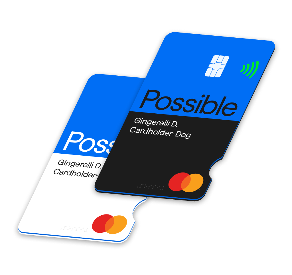
The Possible Card has a few advantages over a Loan. First, you don’t to fill out a form, wait for approval and then transfer the money to a bank account. You can always carry a card with you or add your card to a digital wallet.
repayments
immediately
balance over time
monthly fee
I inherited a lot of screens but very few requirements
The first designer on the project was super talented. She had a ton of experience with 0 to 1 products and I was lucky to inherit a good foundation.
There was a vision. At that point, though, we didn’t have a ton of consistency. We were also trying to understand what the requirements were. We made things up on the fly.
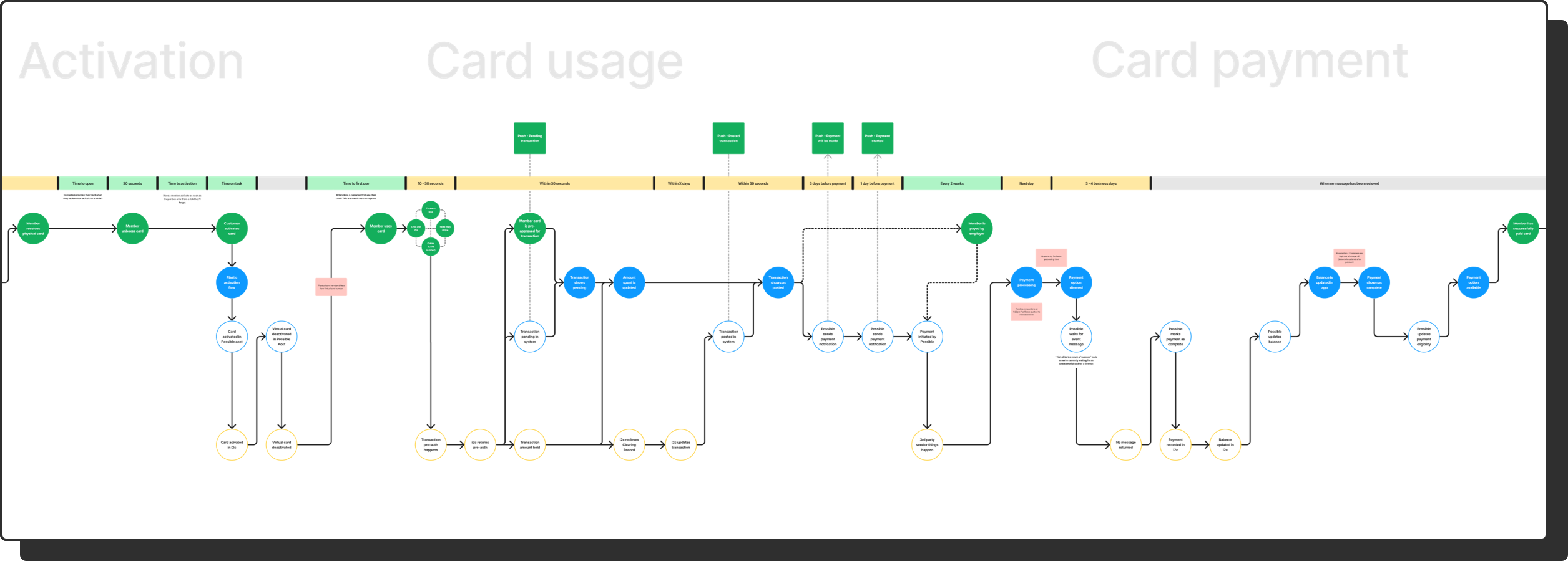
I stepped back to map the journey so we could build context.
We needed to align on what we were doing and why. For me this meant listening to people talking about the details of a passion project.
We mapped the entire experience and the relationship between the Customer, Possible and our external partners. This was a great onboarding resources as new engineers, designers and leaders joined the company.

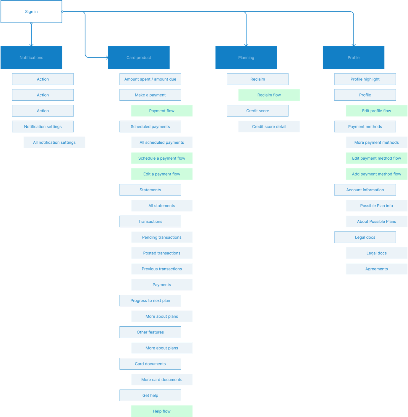
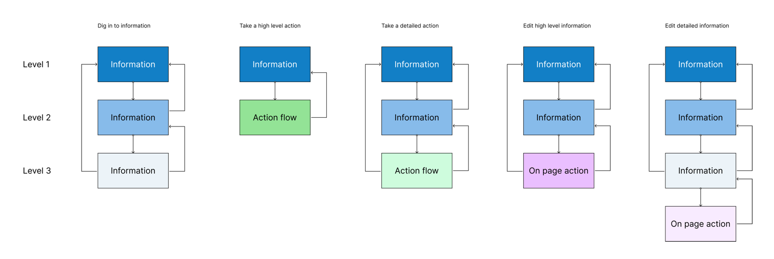
The first step was updating our navigation for a new product.
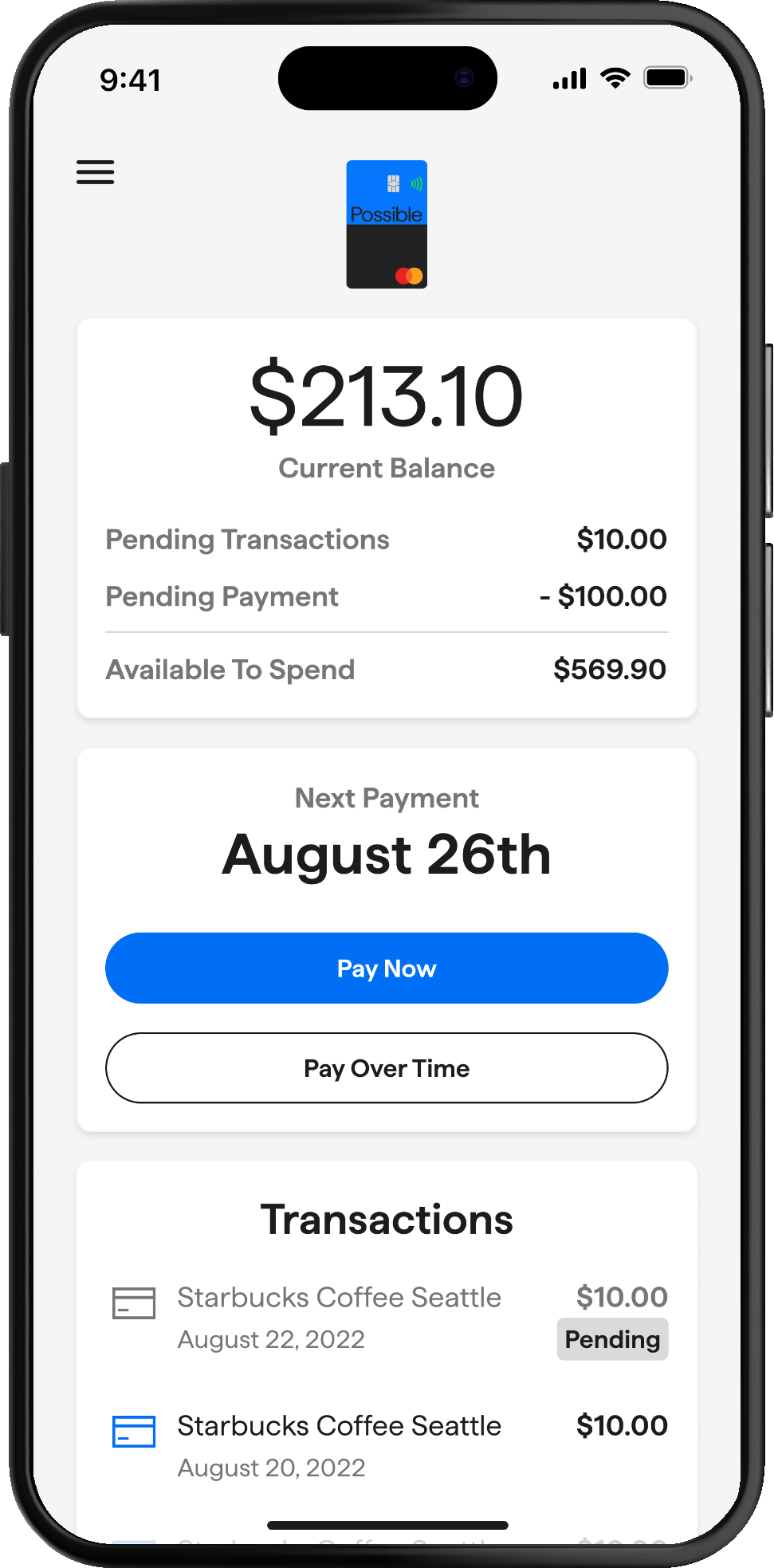
Launching the card meant we needed to update our navigation structure to include 2 products and soon 3 - we were working on the early stages of a cash advance product.
While we were building the card, in late 2021, we approached The New Company to help us with a rebrand. The original Possible brand was defined in 2019 and updated throughout 2020.
I ran usability tests to better understand our activation flow.
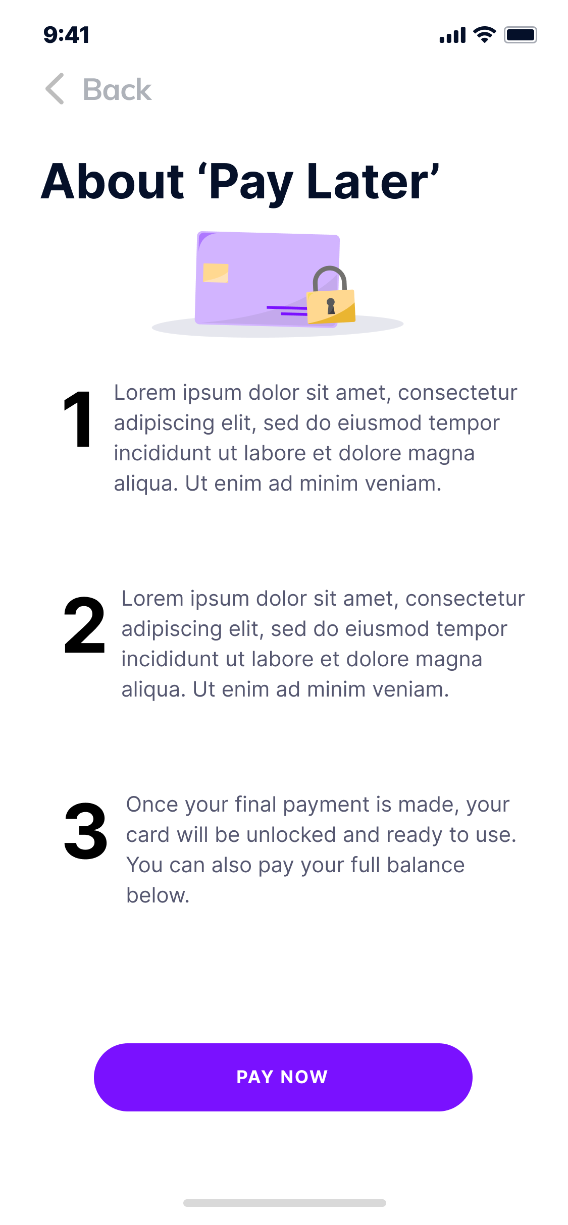
The biggest disparity was in the application flow. That’s not great. This is the first impression people have with using the card and it was a confusing mess. Looking back, it’s not difficult to understand why - we were trying to explain rules that we were also trying to uncover. Some of the information was inaccurate, some of it was confusing and some business decisions were just misaligned with the customer’s mental model.
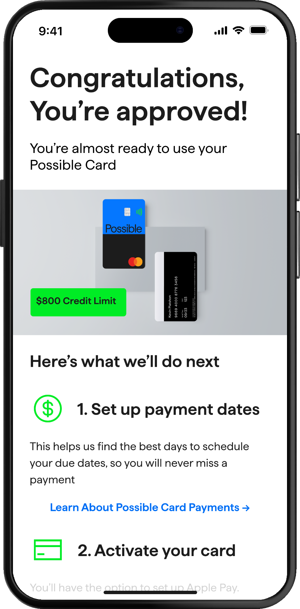
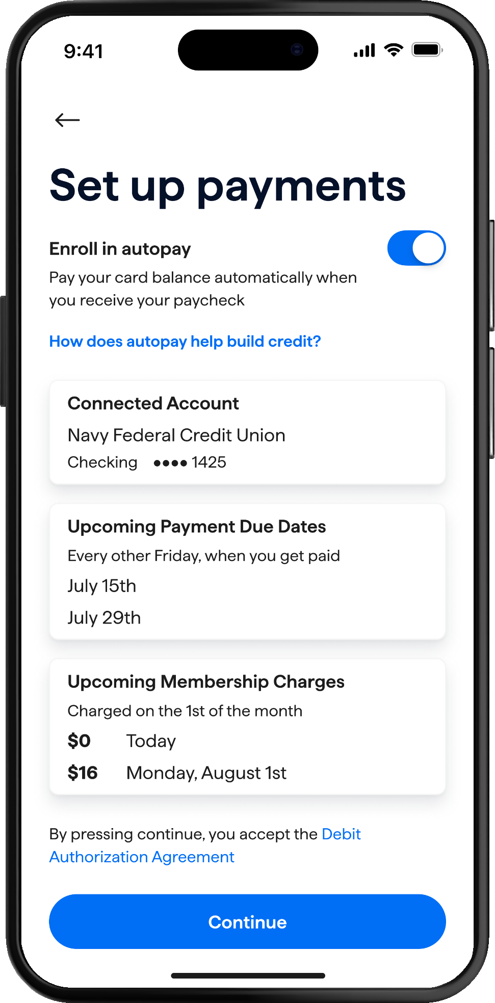
Redefining the application flow became a high priority task. This is where the customer is approved, sets up their payments, agrees to some legal terms and we mail the physical card.
95%
Application
58%
Activation
89%
Dashboard
78%
Payments

Updating the approval flow increased satisfaction by 45%.

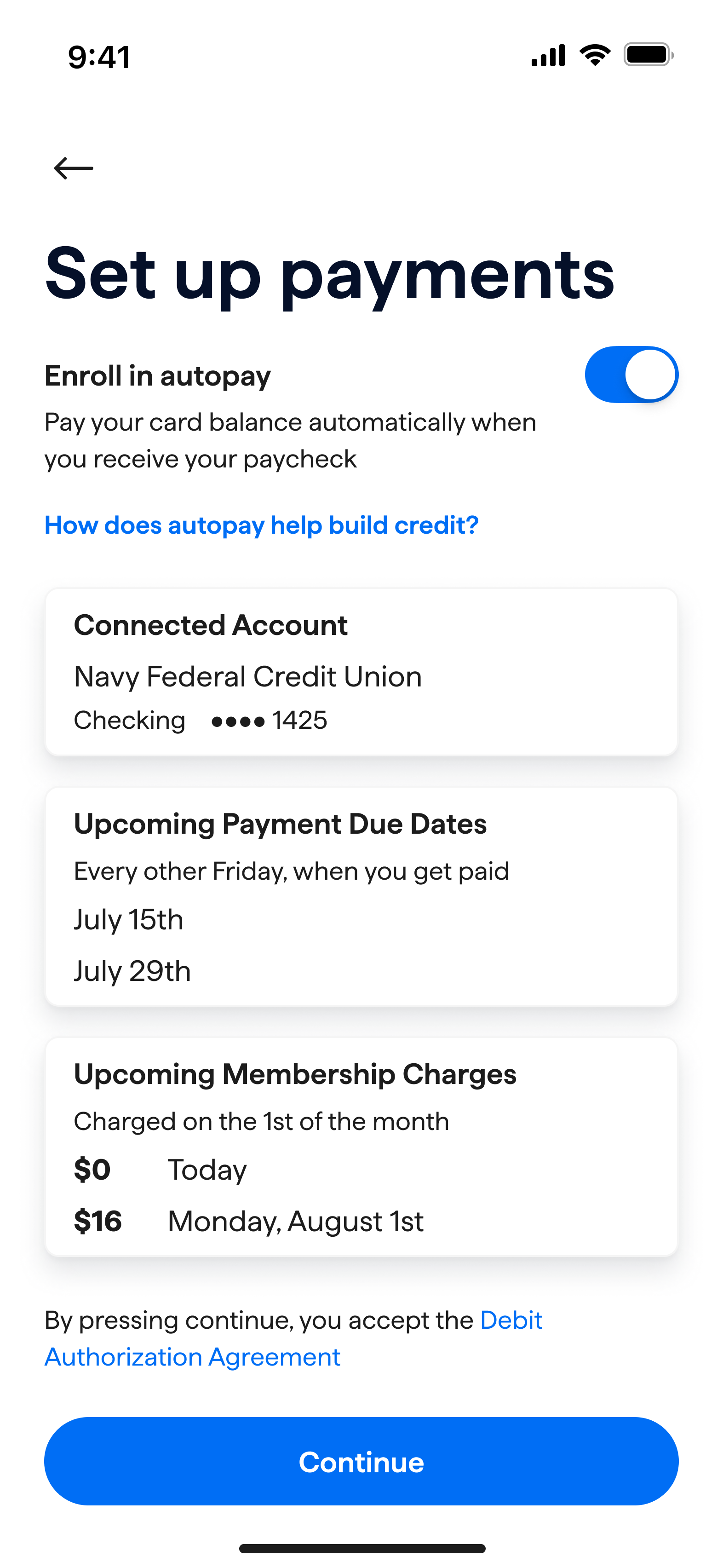
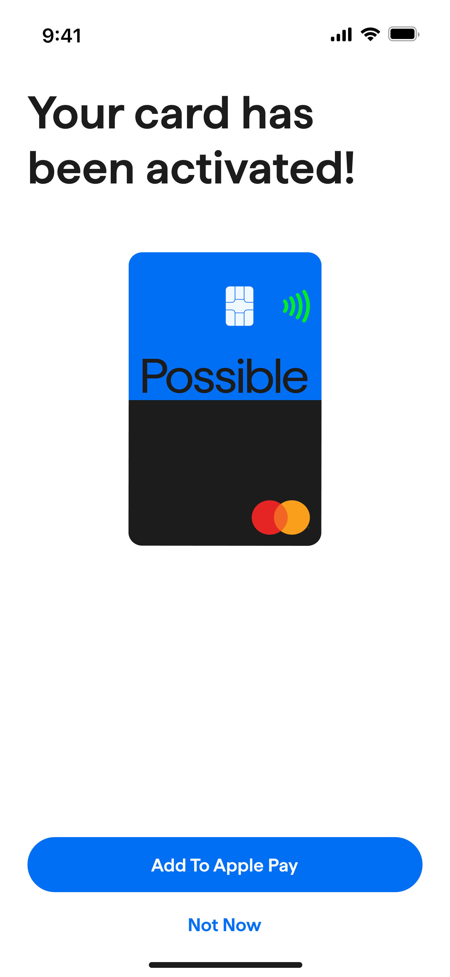
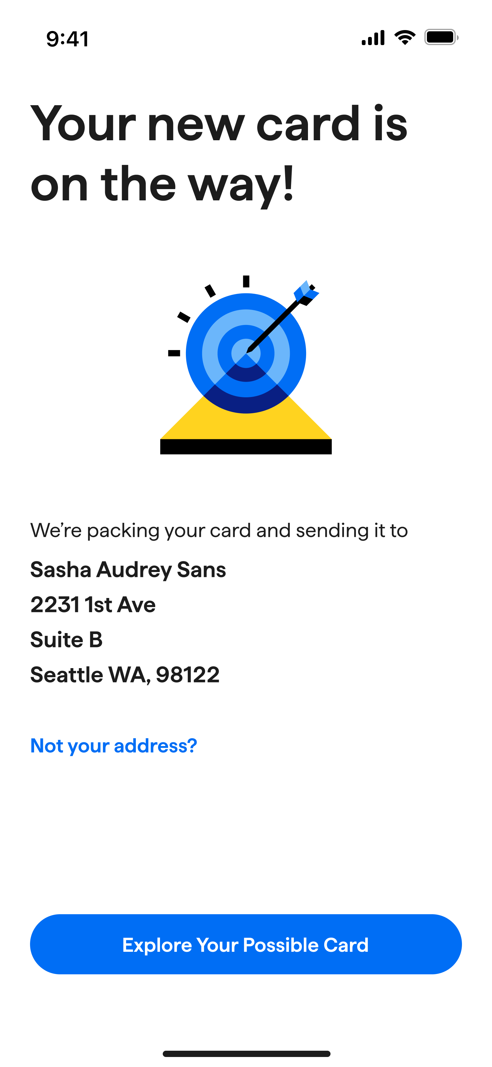
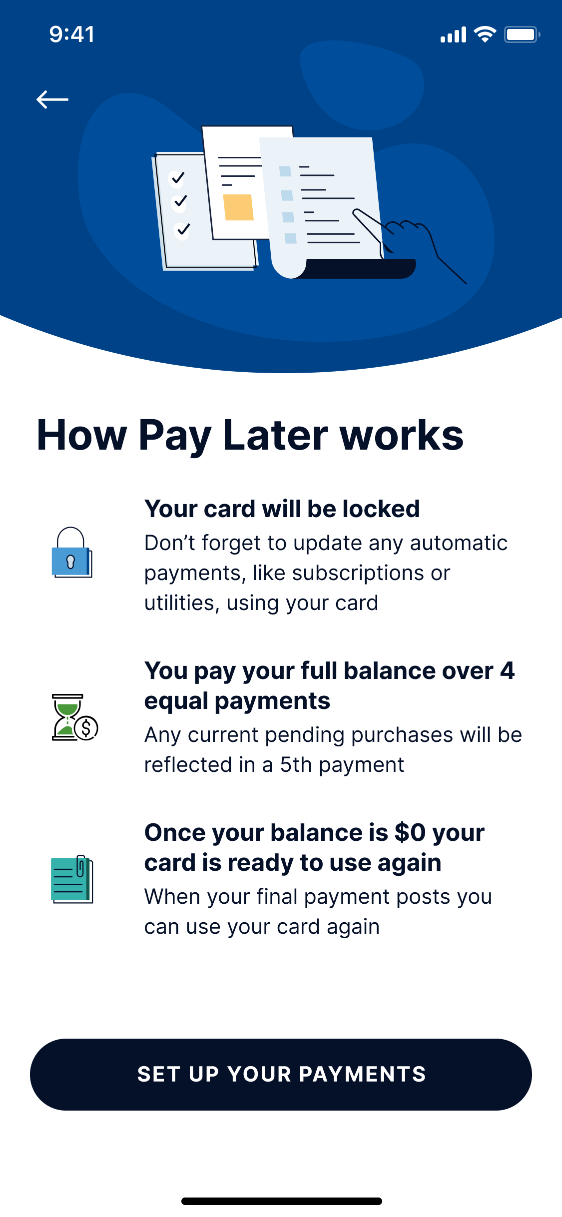
We simplified the approval process.
We encouraged payday-aligned automatic payments.
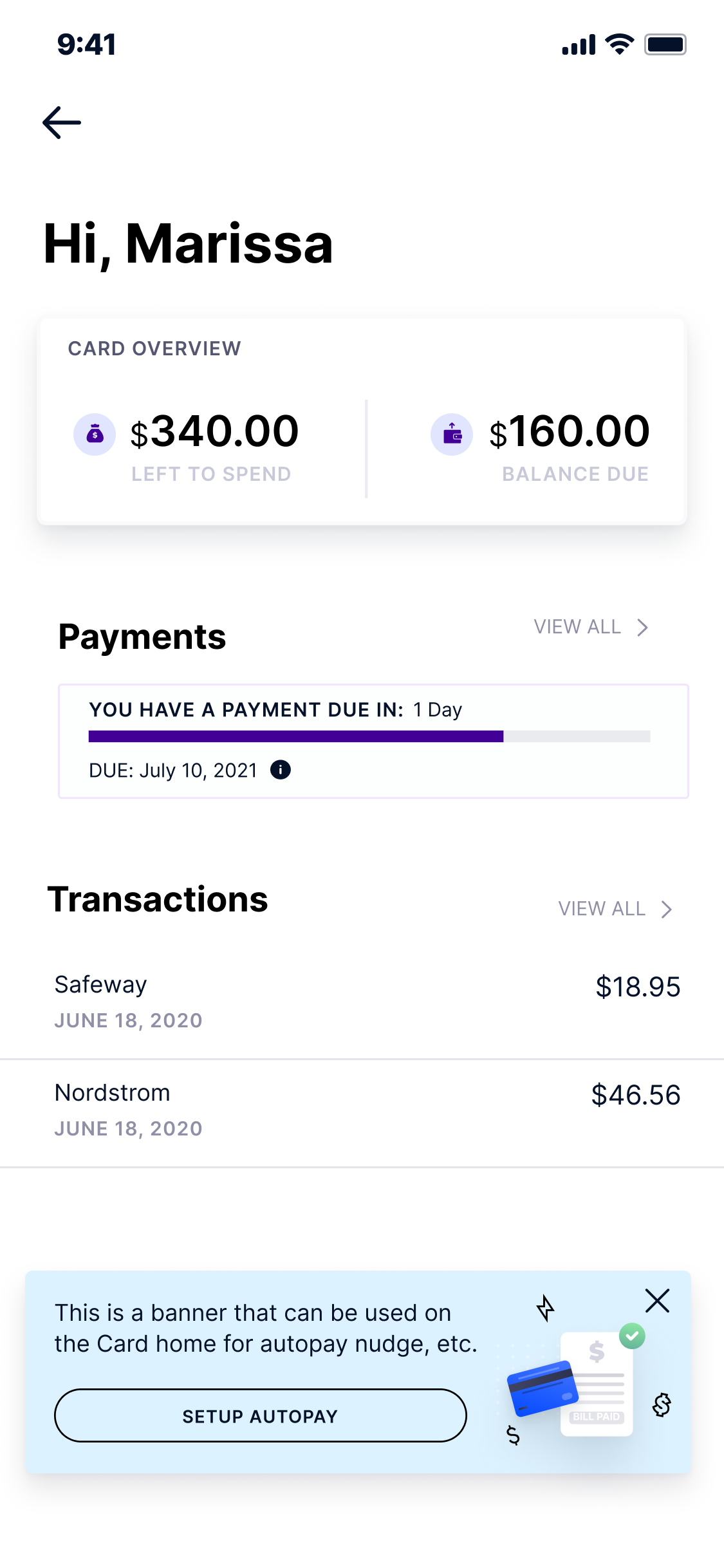
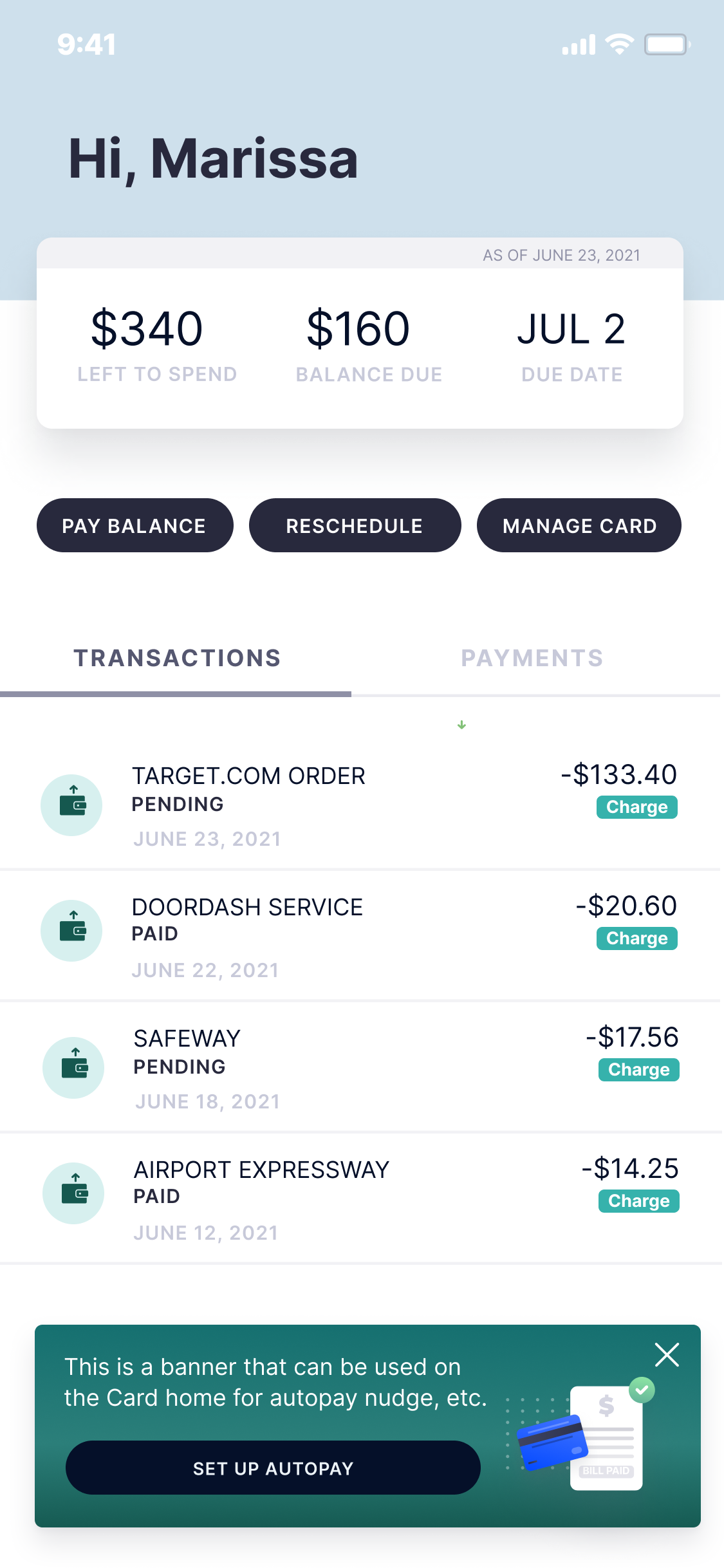
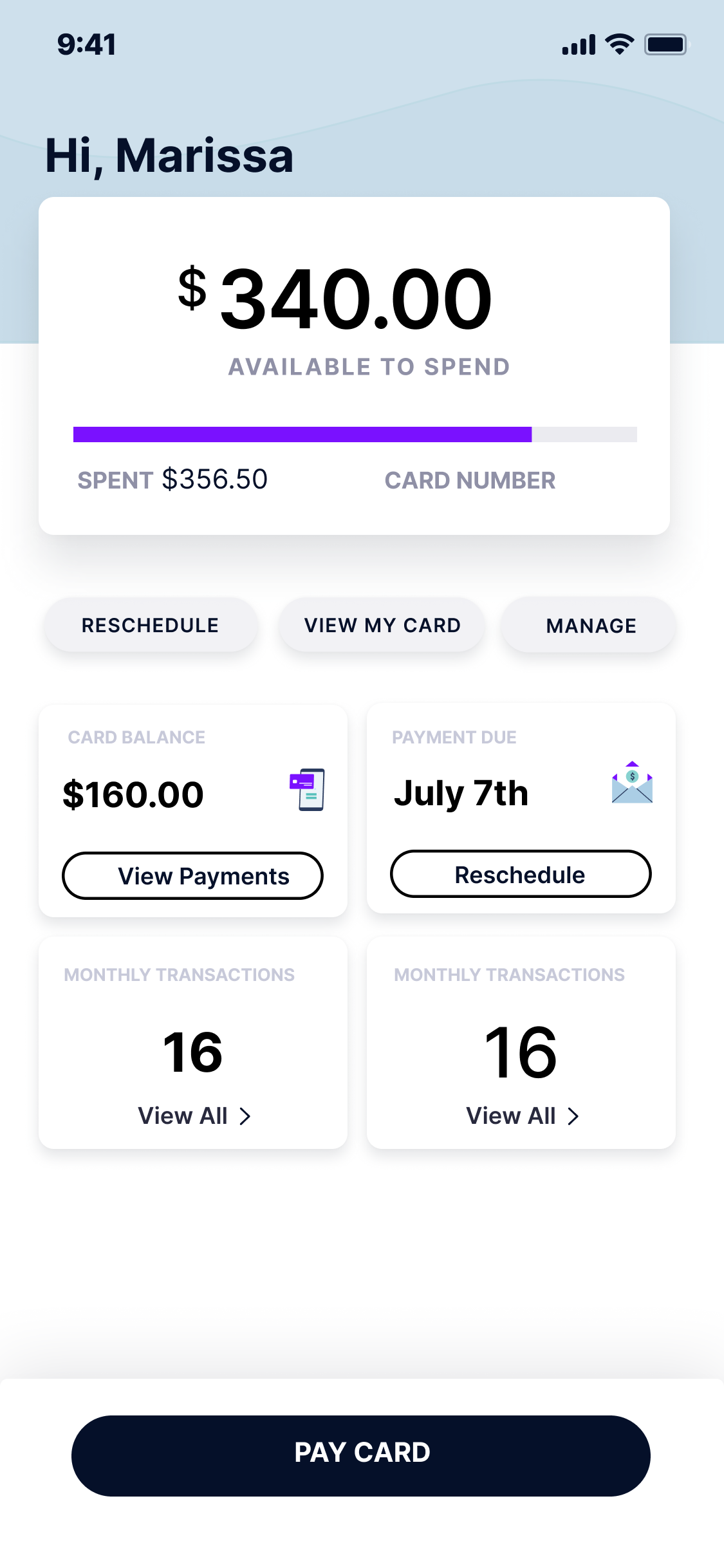
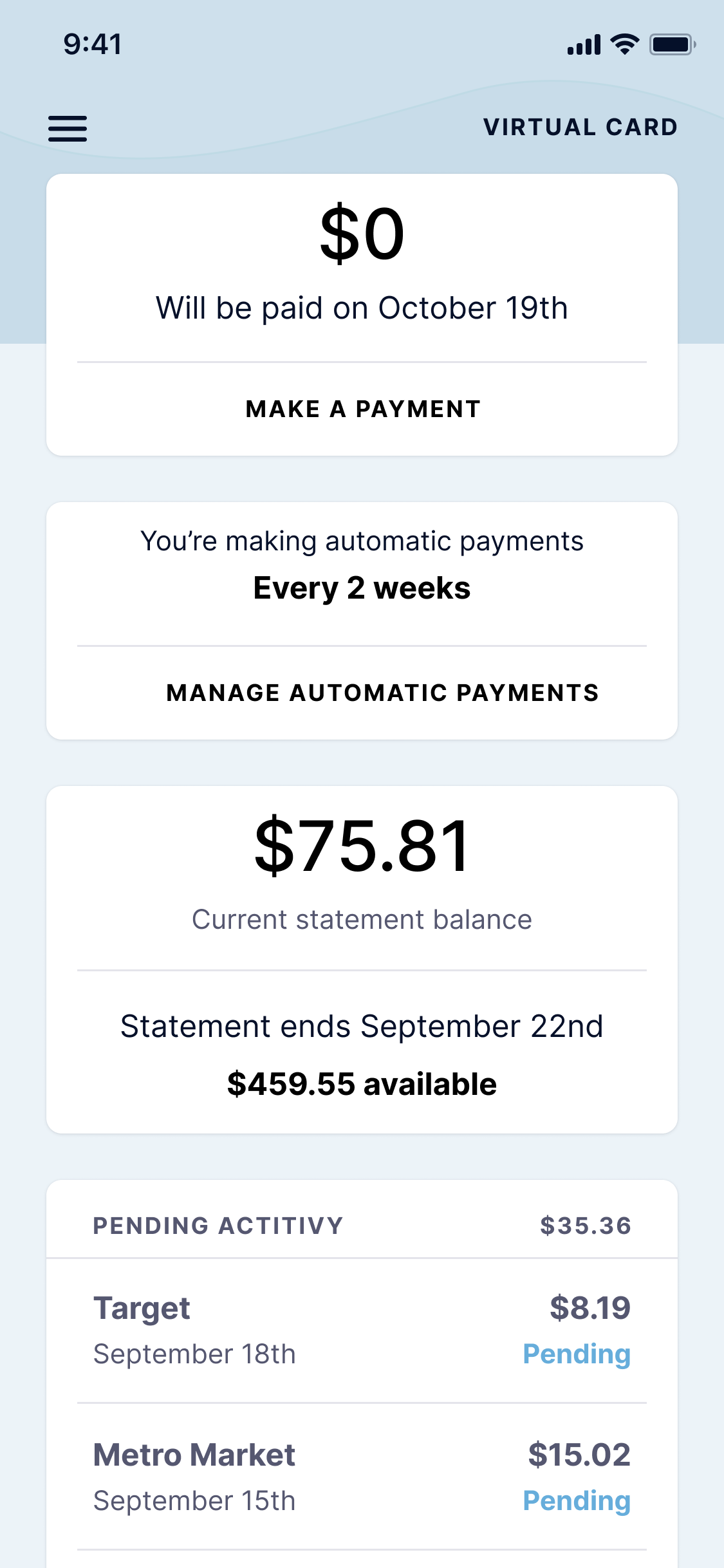
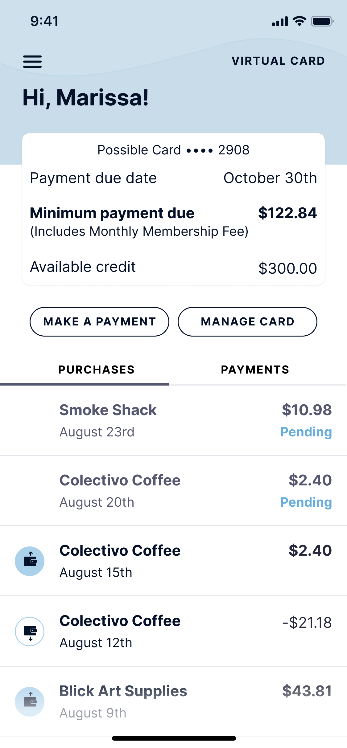
We created a new dashboard to support more than one product.
Our customer satisfaction increased from 58% to 84%.


If you enjoyed this case study, check out these awesome stories.
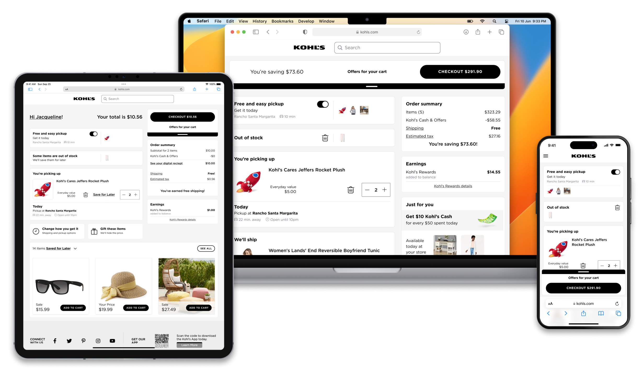
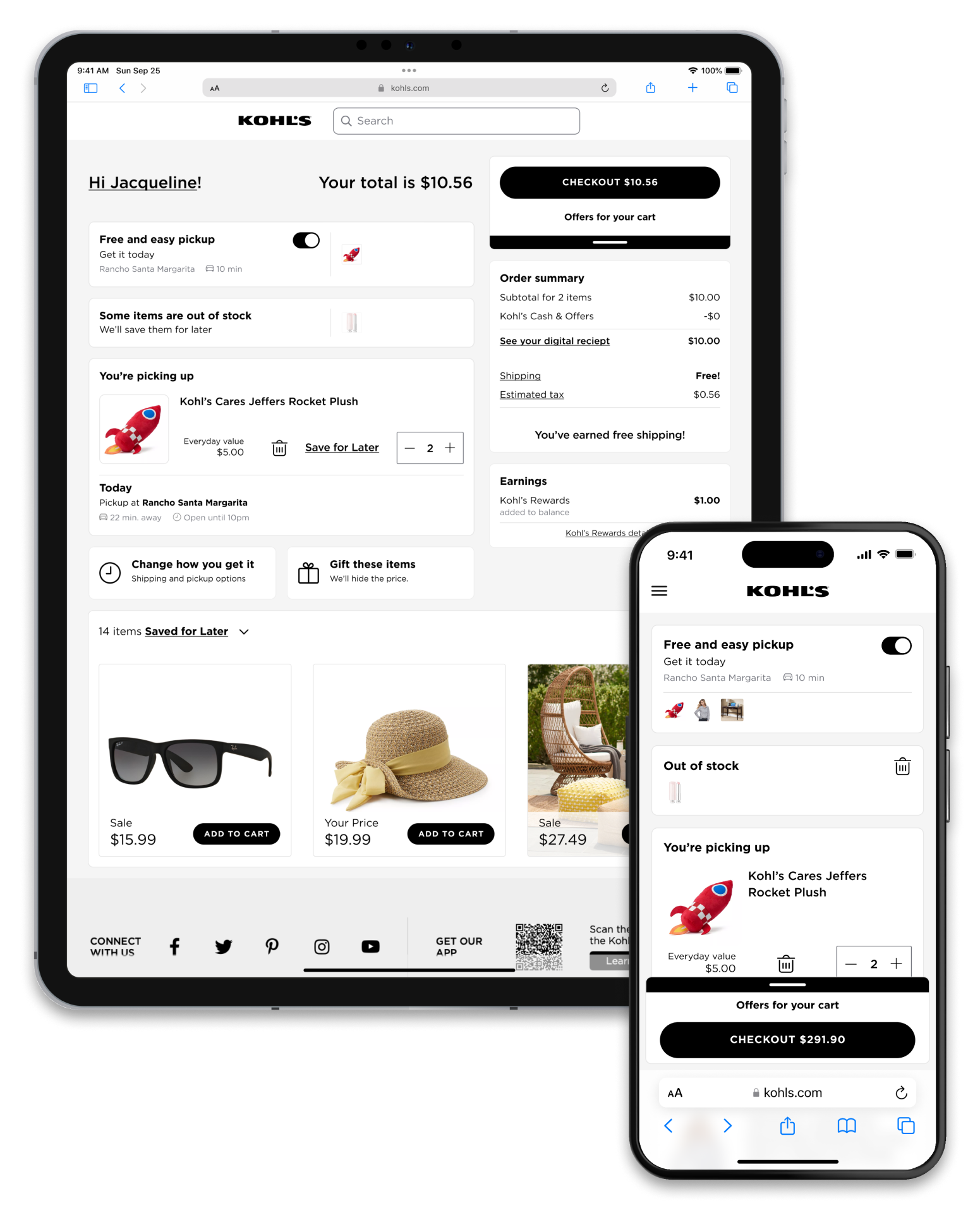
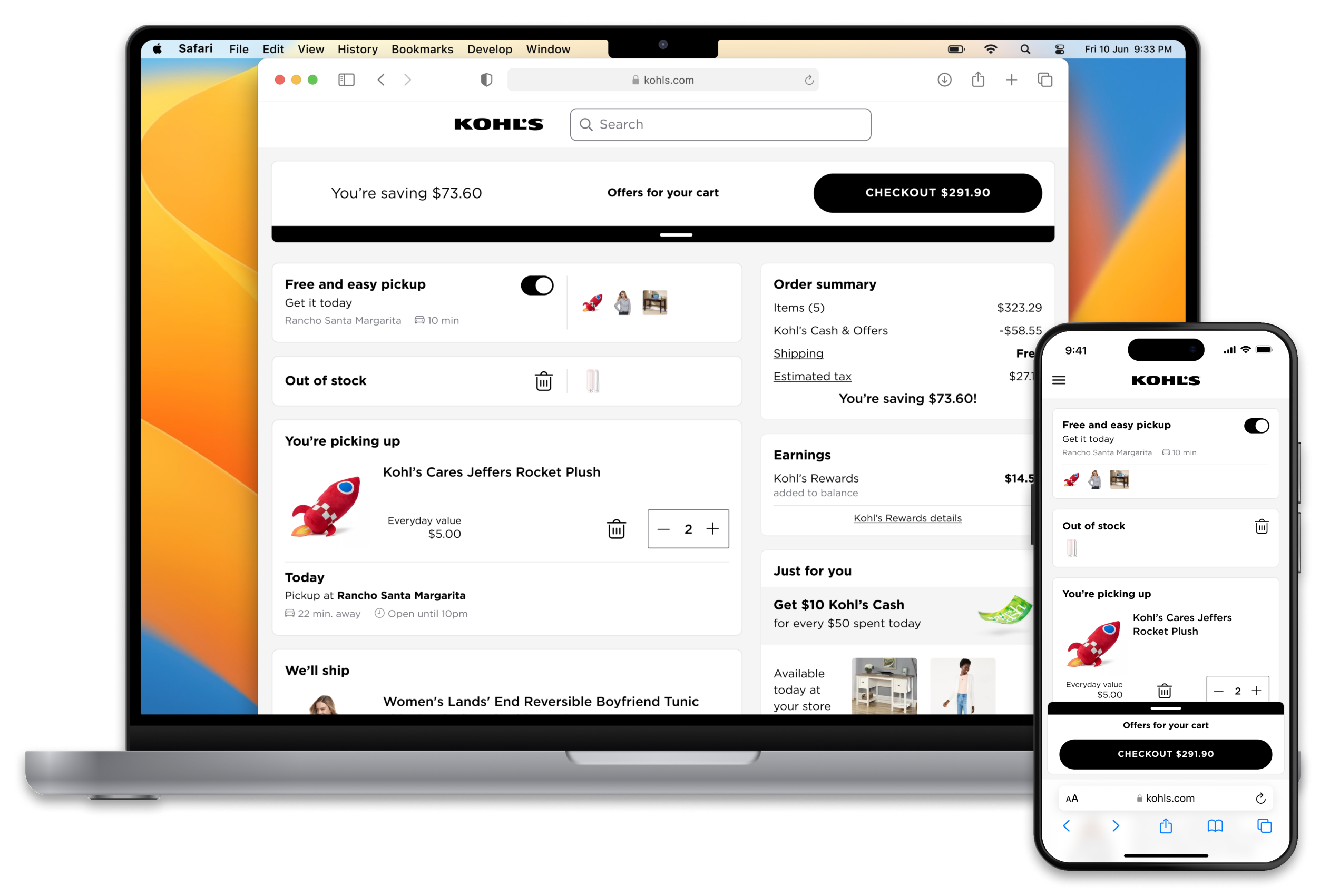
Kohl's
Cart and Checkout
A new way to shop online and save products for later
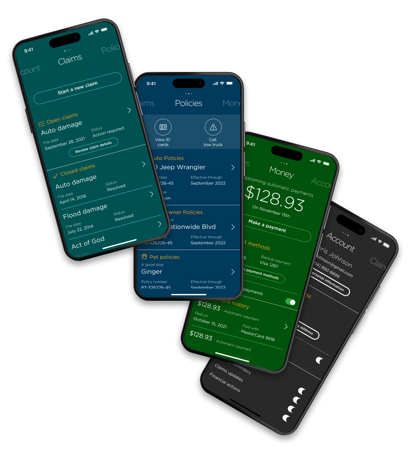
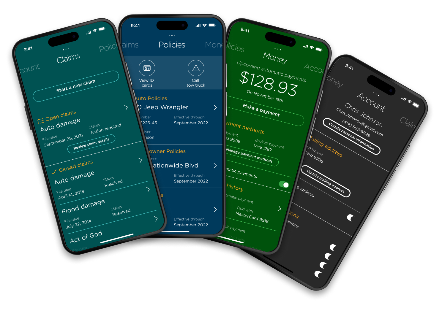
Nationwide
Redesigned mobile app
A new way to manage policies, money and claims
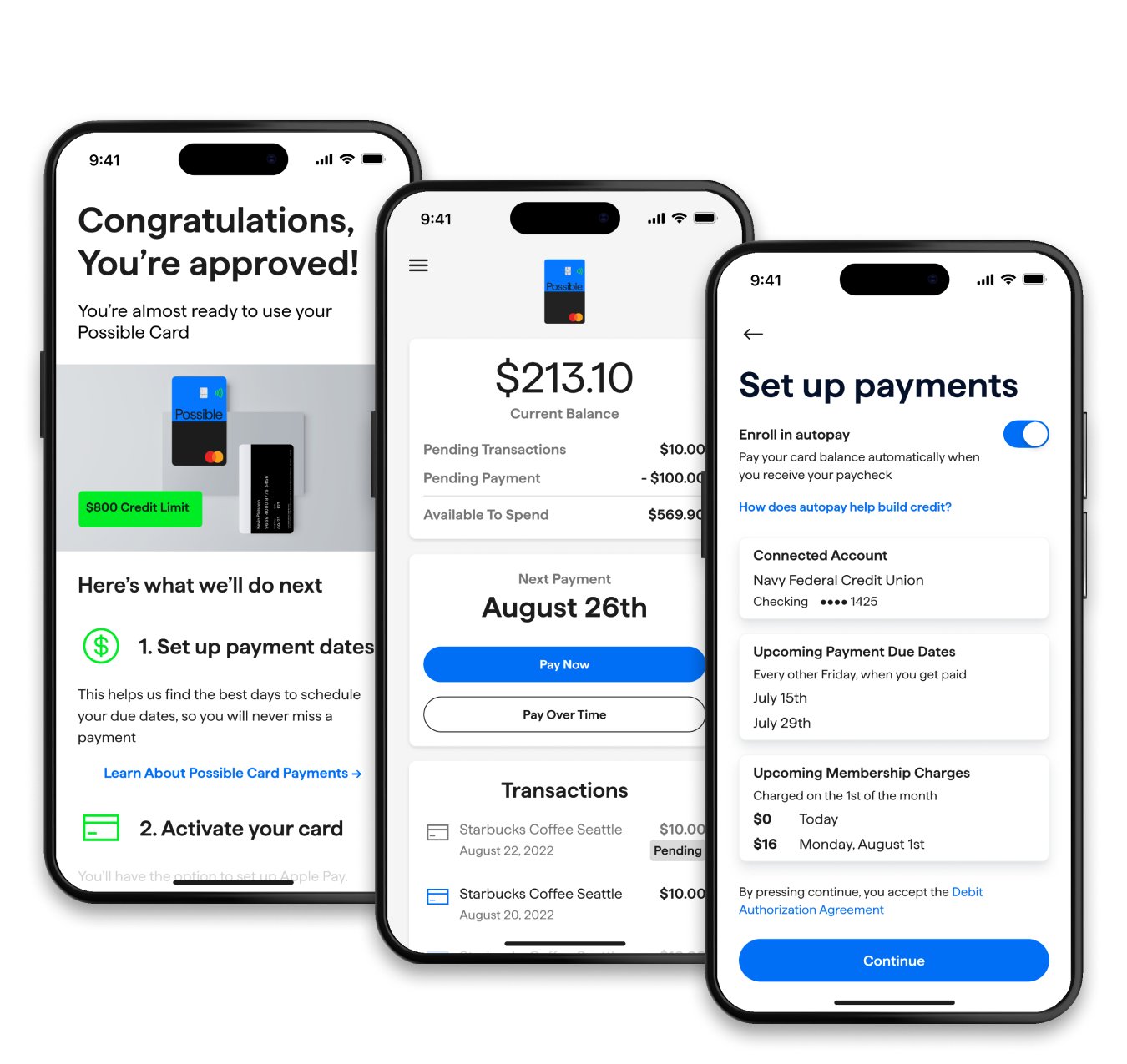
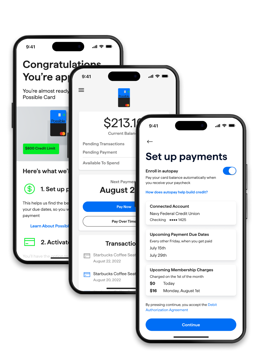
Possible
Credit card
Build credit and catch up on bills without a credit check
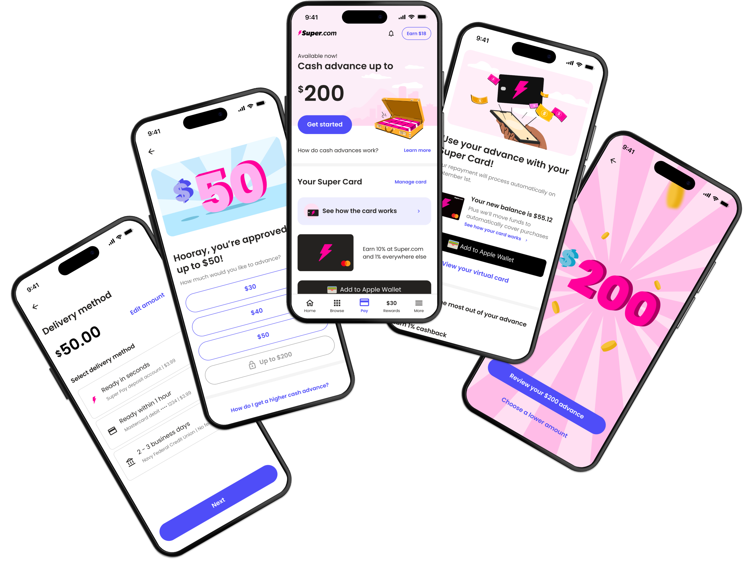
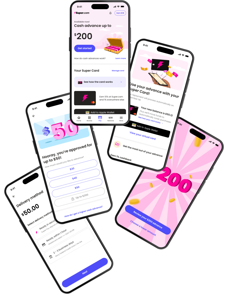
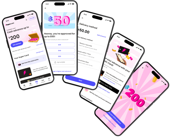
Super.com
Mobile app (iOS/Android)
An all-in-one app to save money, get a cash advance, earn rewards and build credit.