Nationwide
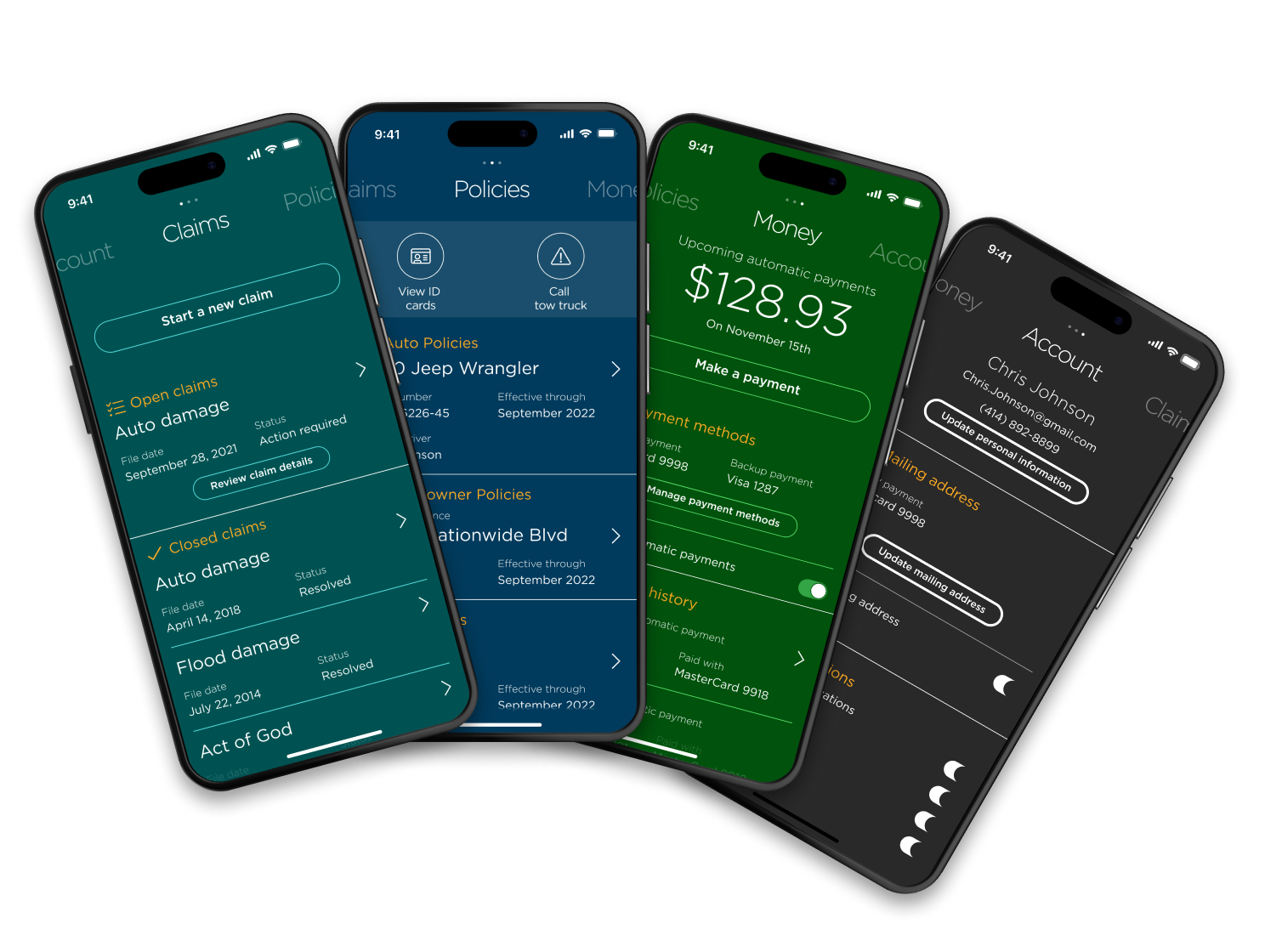
Redesigning an insurance mobile app for a modern audience
Project overview
Nationwide's structure can be felt in its digital experiences. Different business units may have dramatically different flows and those systems don't talk to each other any more than the people who built them.
I led the UX team and partnered with a Scrum Master to plan sprints, prioritize tasks and generate billing hours (we operated as internal consultants).
I was the only person on our UX team that was communicating with 7 separate development teams, the design leadership team and our business leaders (including the Chief Marketing Officer).
I was an interaction designer at Nationwide but I also inherieted the Lead role. This meant doing the day-to-day IC work while managing output and handoffs for my Visual Designer, Copywriter and Front-End Developers.
Ongoing for 12+ months
• Wireframes from Axure
• Information architecture diagrams
• Billable hours for the team (provided weekly)
7
Development teams
120+
Stakeholders
1.2 ★
App Store rating increase
This is how we modernized a legacy insurance mobile app.
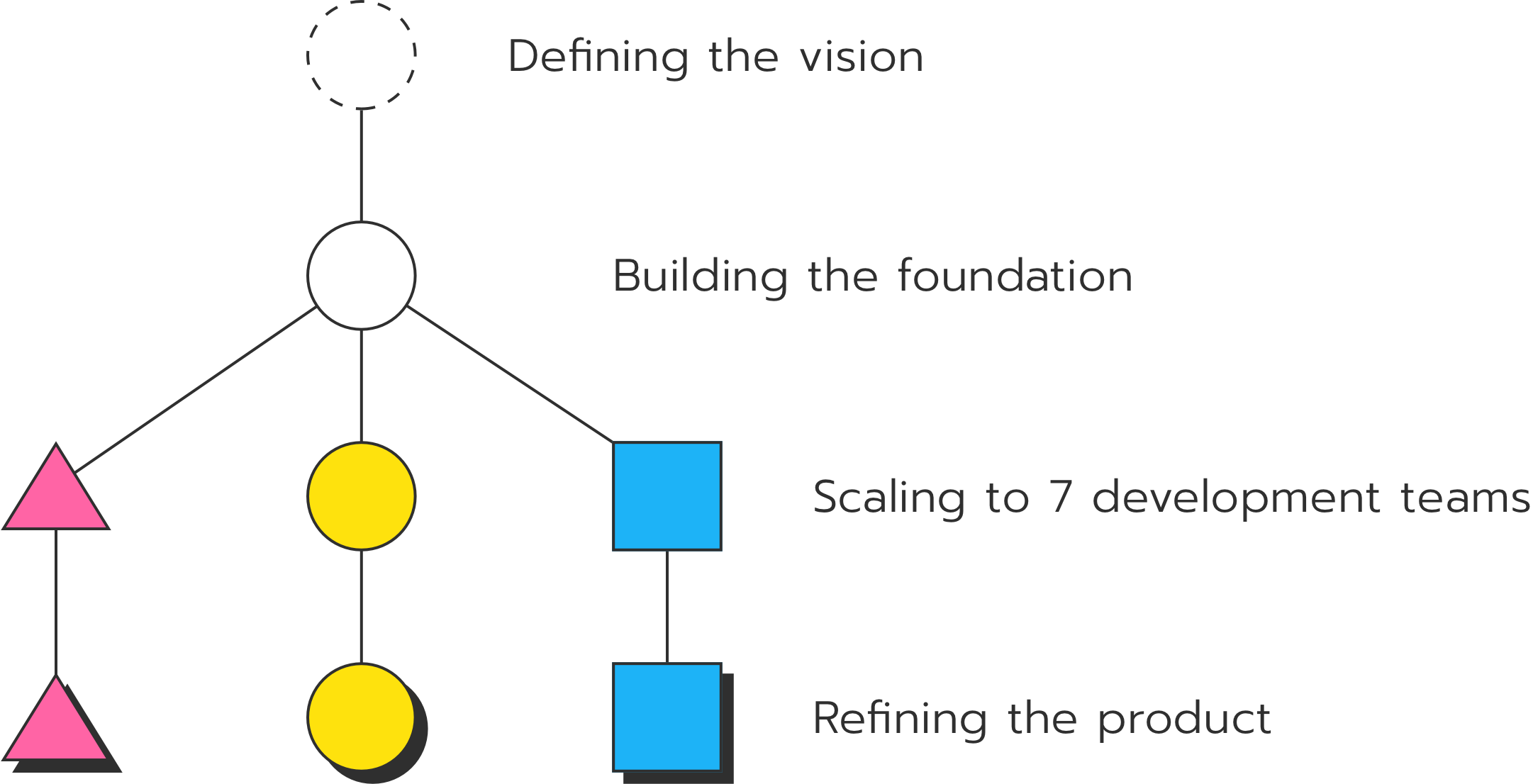
We started with an incredibly open ended blue sky app design. Similar to some of the other products I've worked on, this vision was more or less a final view of what the UX team thought the app should be.
My job was to build the foundational design system and work with the engineering teams to get us to that vision.
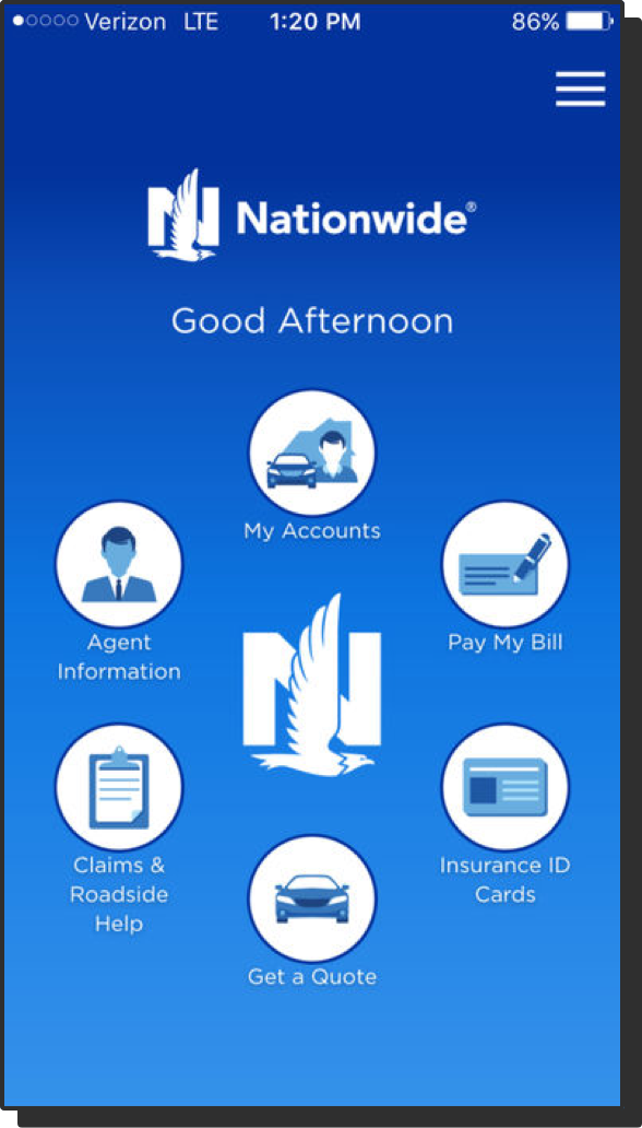
We started with an app built in the mid-2000's.
All of the information you might need was there but to do anything useful you'd have to dig two, three or four layers deep.
Our Visual Designer created a new North Star.
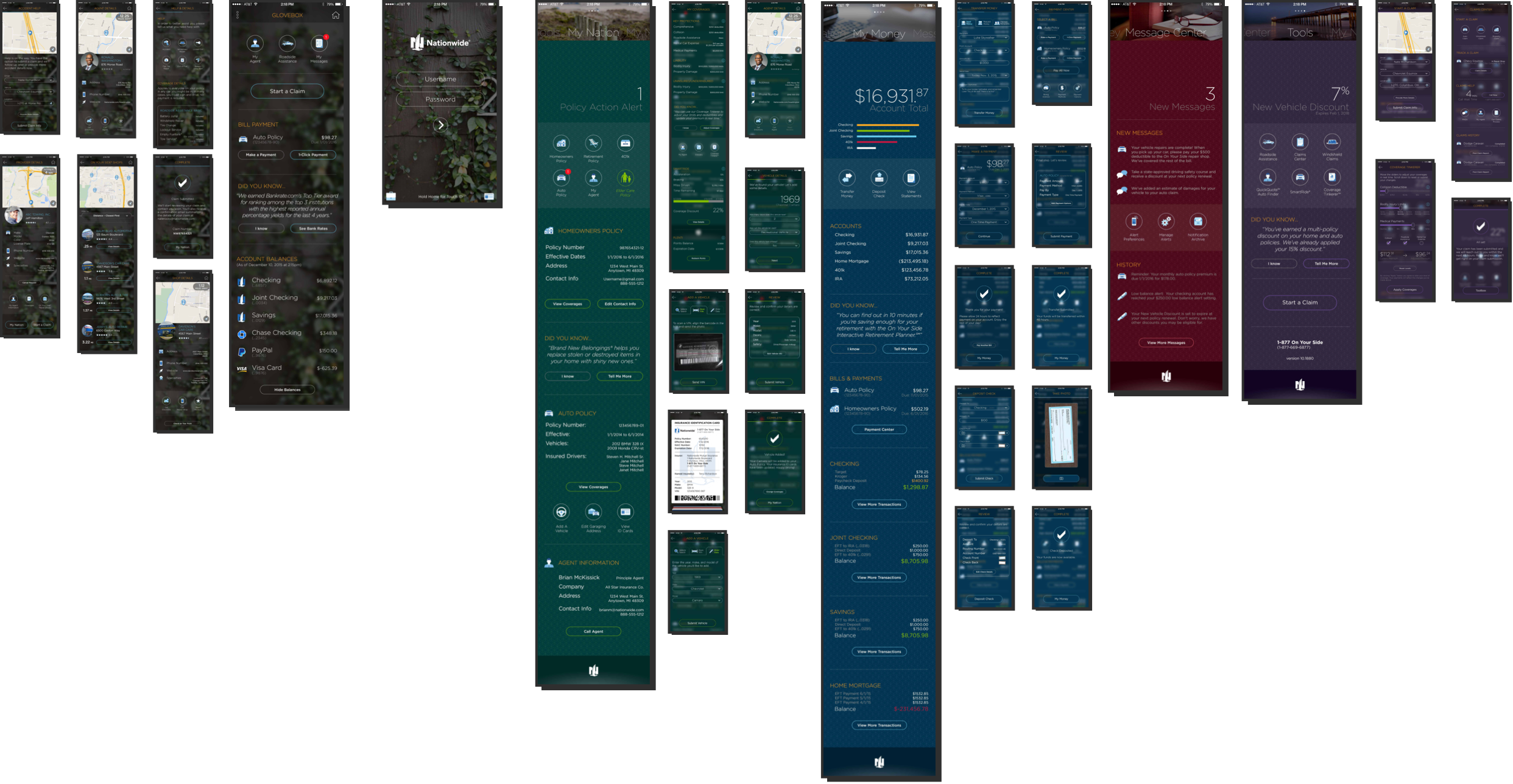
My job was to find patterns and work with 7 development teams.
I was in lockstep with our engineering teams, so much so that our design system became a library of shorthand symbols. This became essential near the end of the project. We were too busy and time was at a premium.
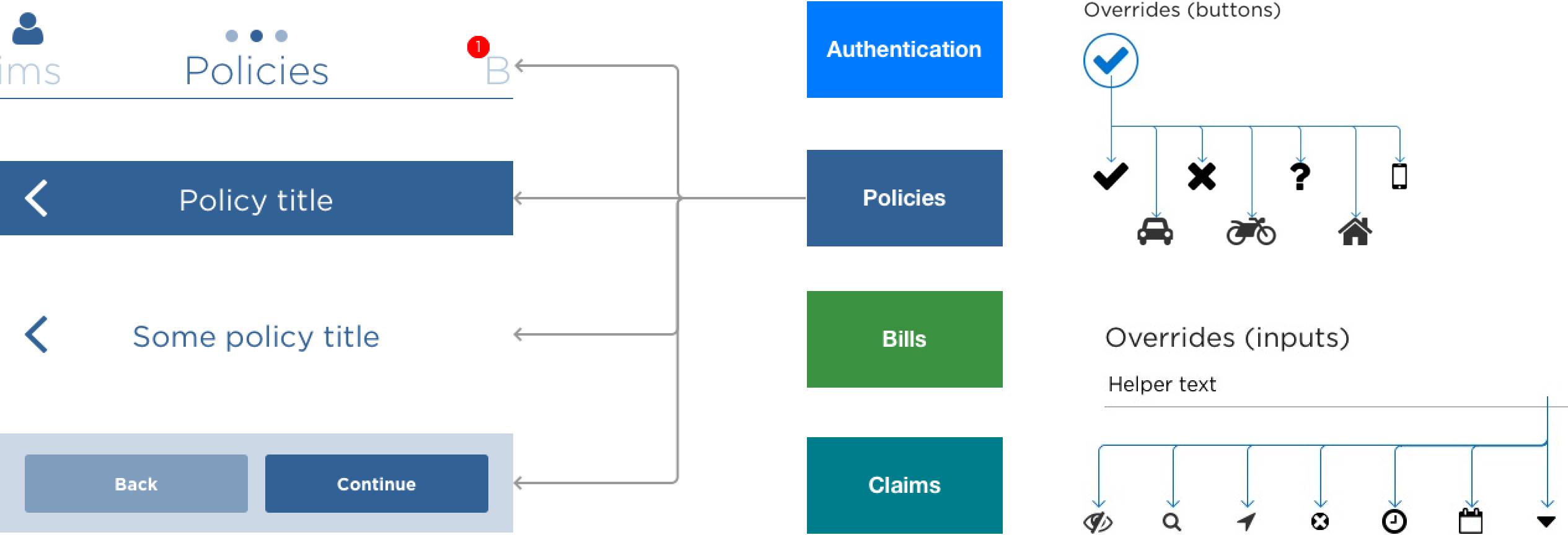
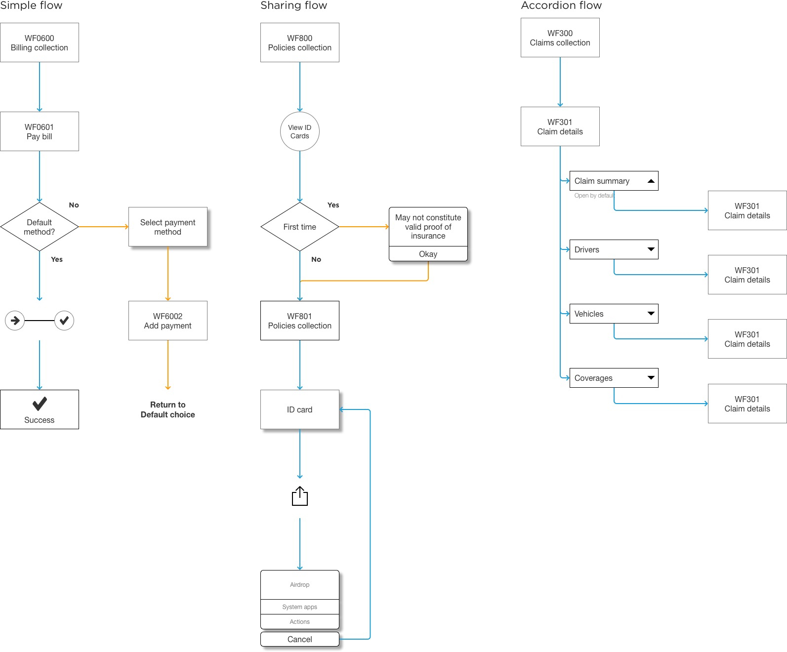
I saved time by creating symbols and flows rather than screens.
Rather than creating distinct pages with placeholder data, I could have a conversation with the team and draw those symbols on a whiteboard. The engineers could start building the page and I could design it in parallel.
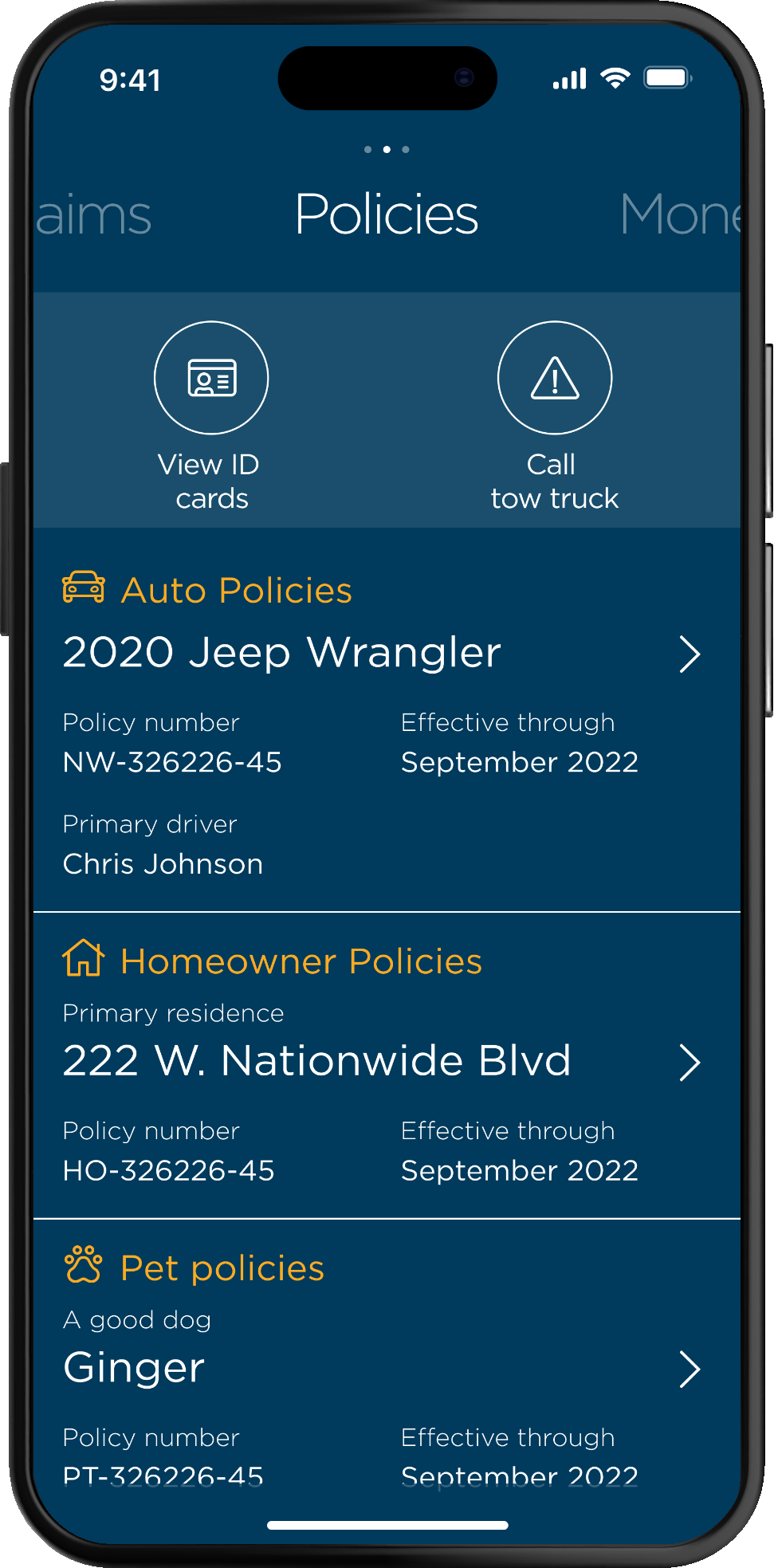
We created a flexible, scalable app for anyone with one policy or 100.
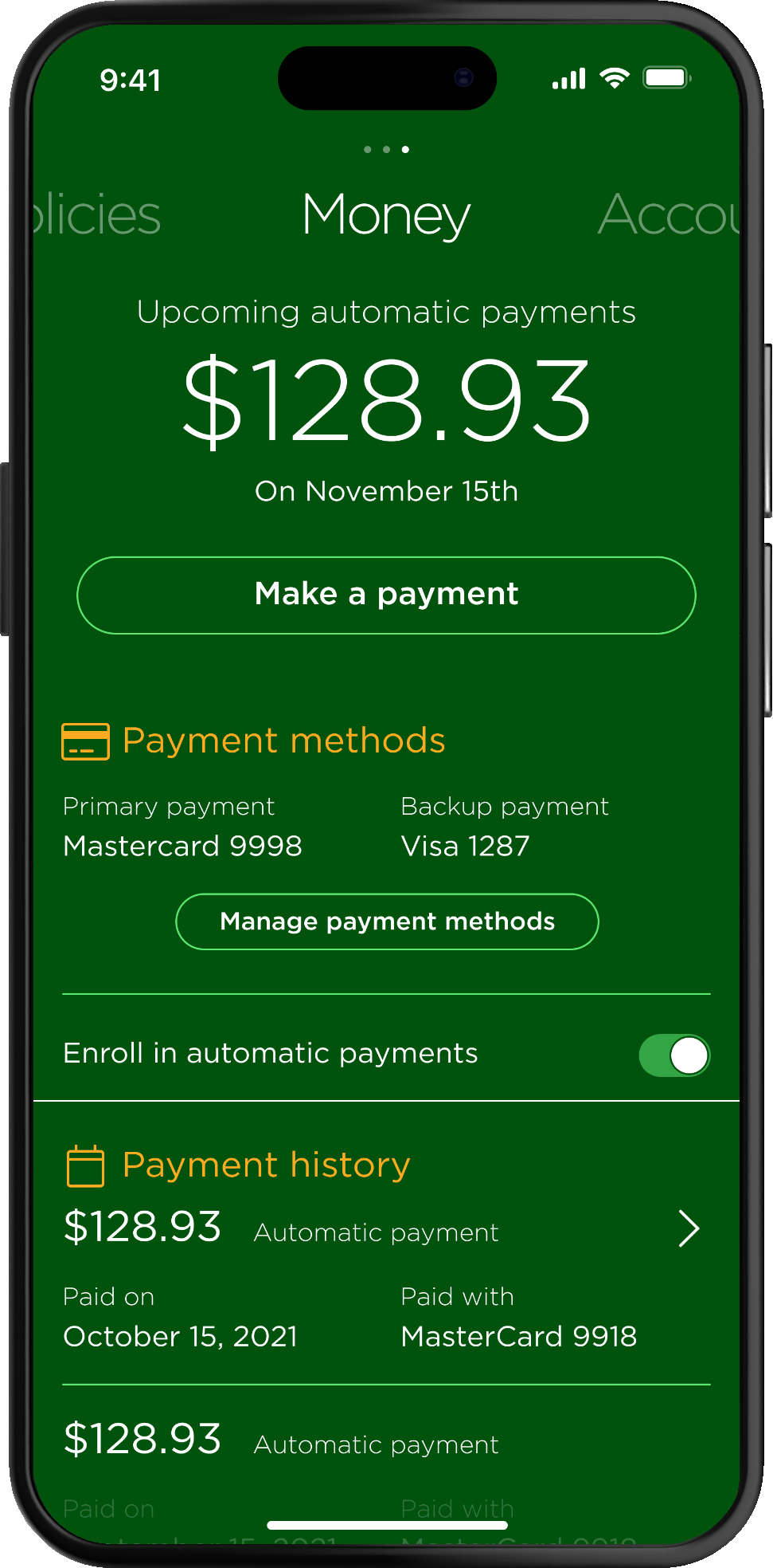
If we needed a new section, we could add new page.
Stakeholders from across the company were thrilled.
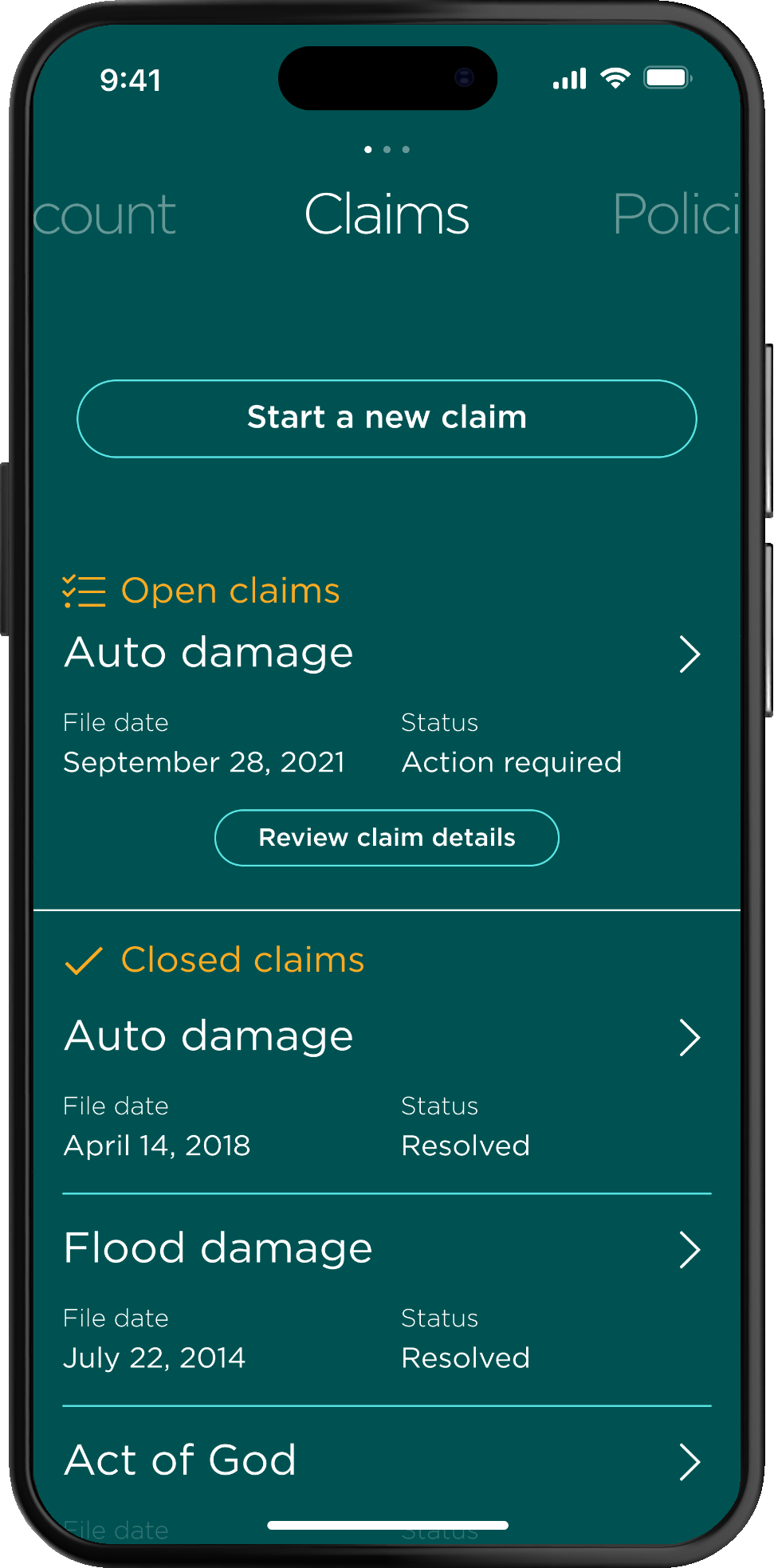
We built a great foundation for new, iterative work.
7
Development teams
120+
Stakeholders
1.2 ★
App Store rating increase
If you enjoyed this case study, check out these awesome stories.
Kohl's
Cart and Checkout
A new way to shop online and save products for later
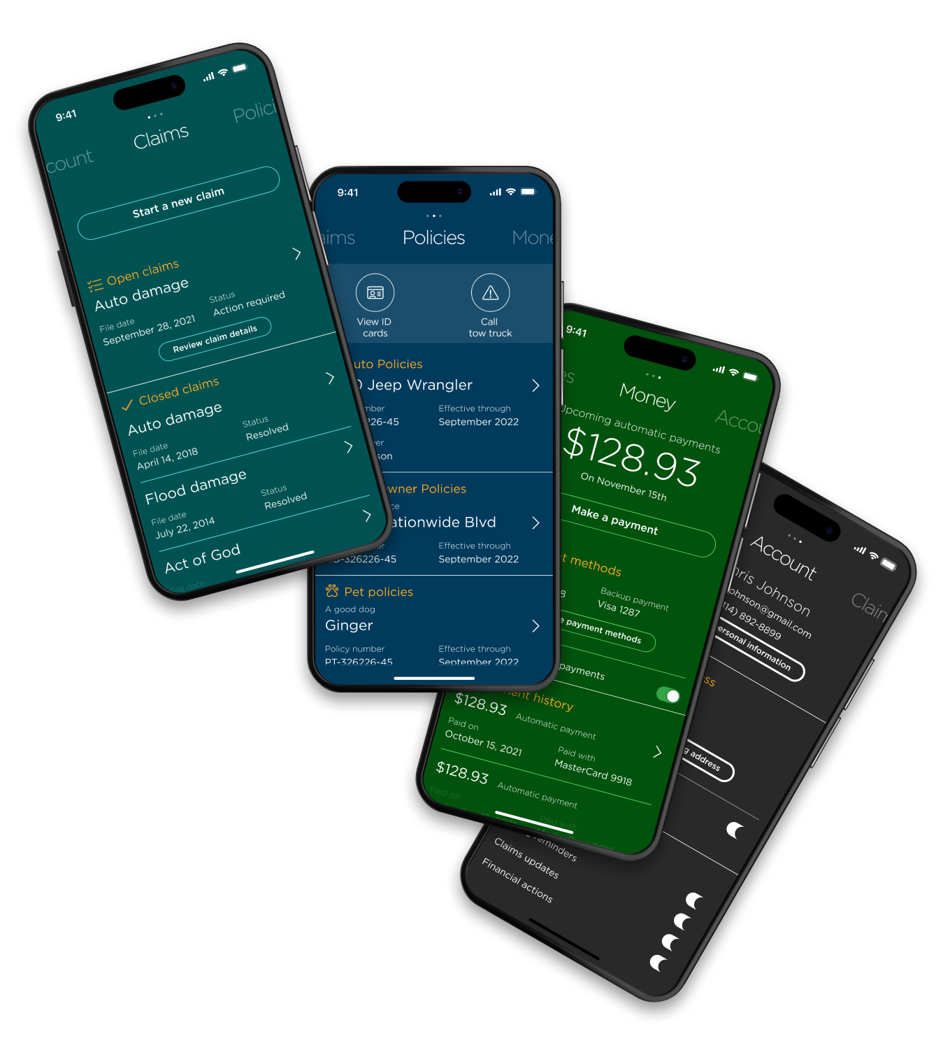
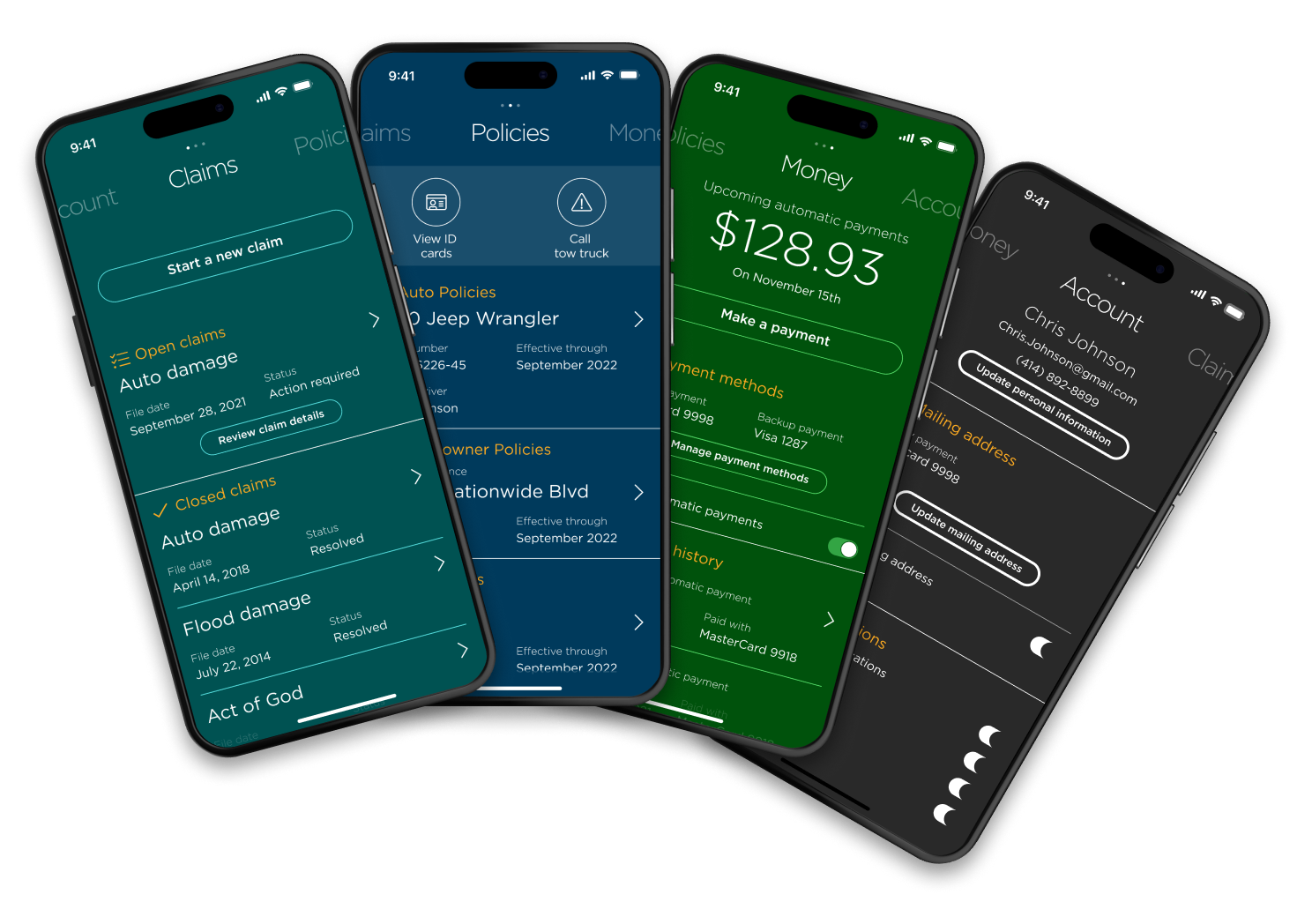
Nationwide
Redesigned mobile app
A new way to manage policies, money and claims
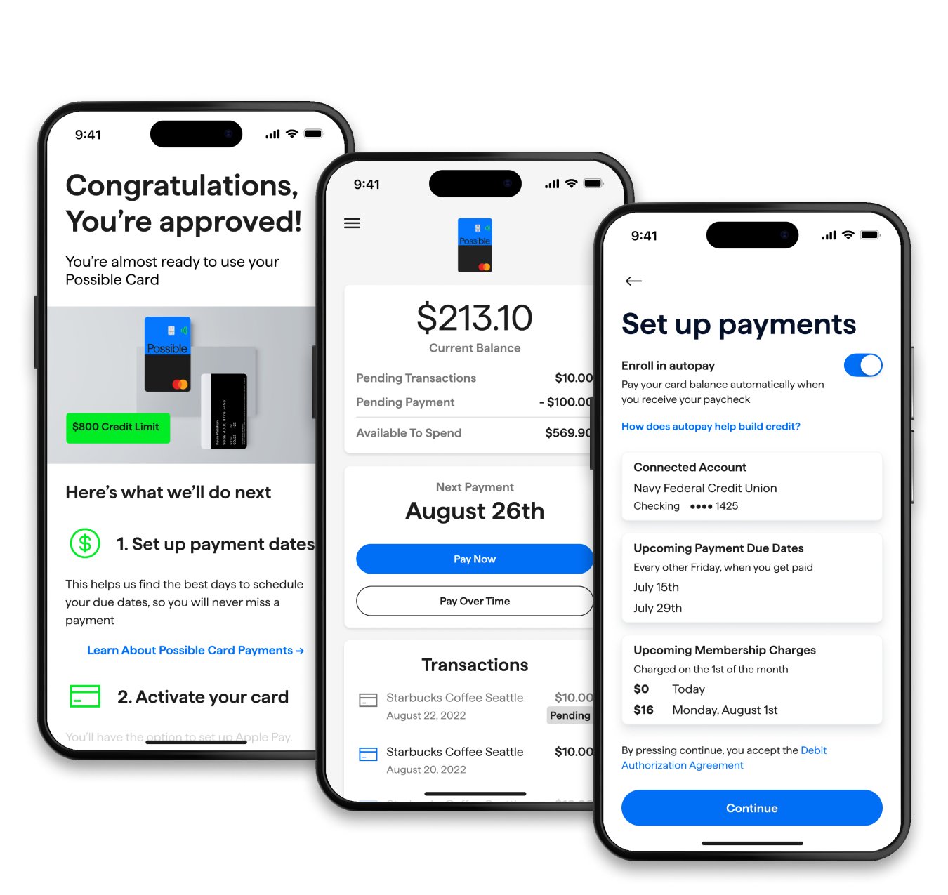
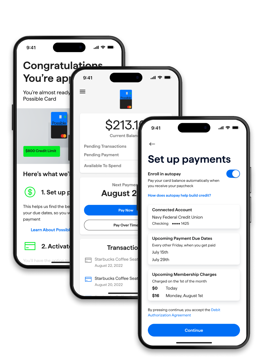
Possible
Credit card
Build credit and catch up on bills without a credit check
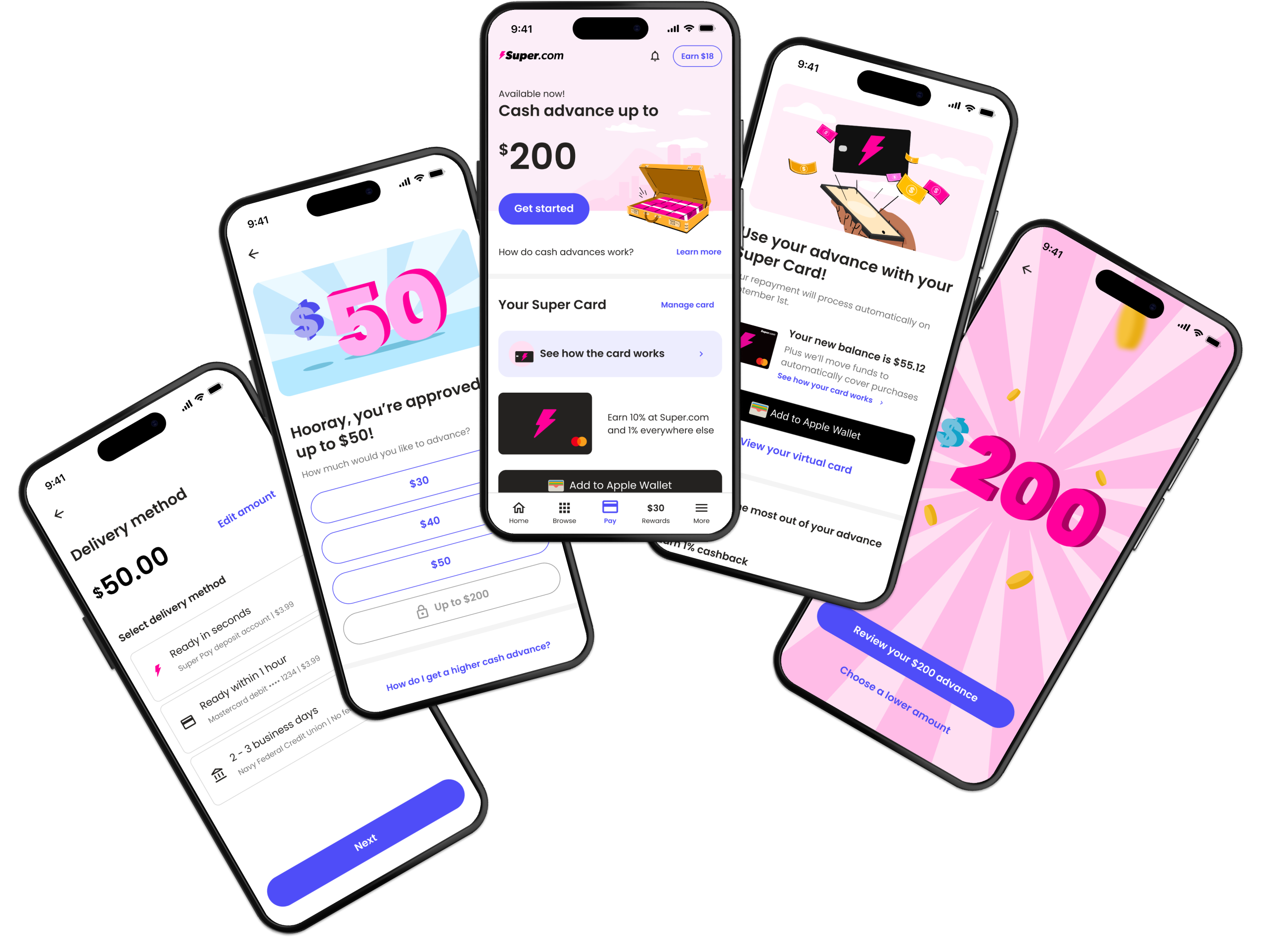
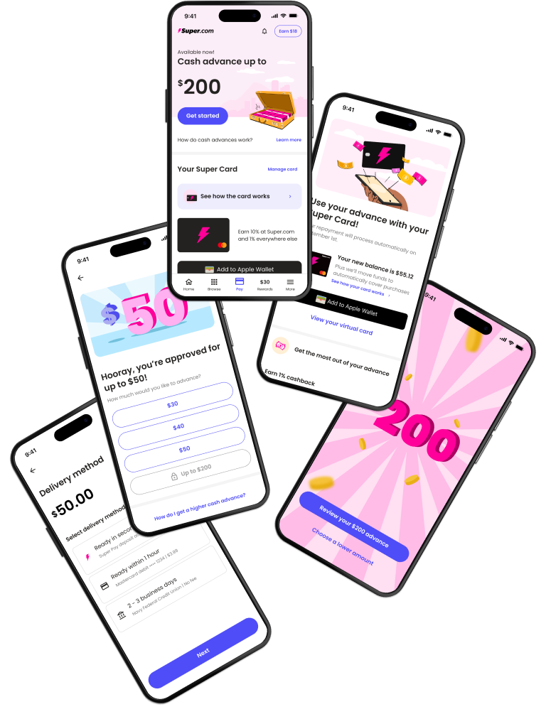
Super.com
Mobile app (iOS/Android)
An all-in-one app to save money, get a cash advance, earn rewards and build credit.